Weeknote 2026/33

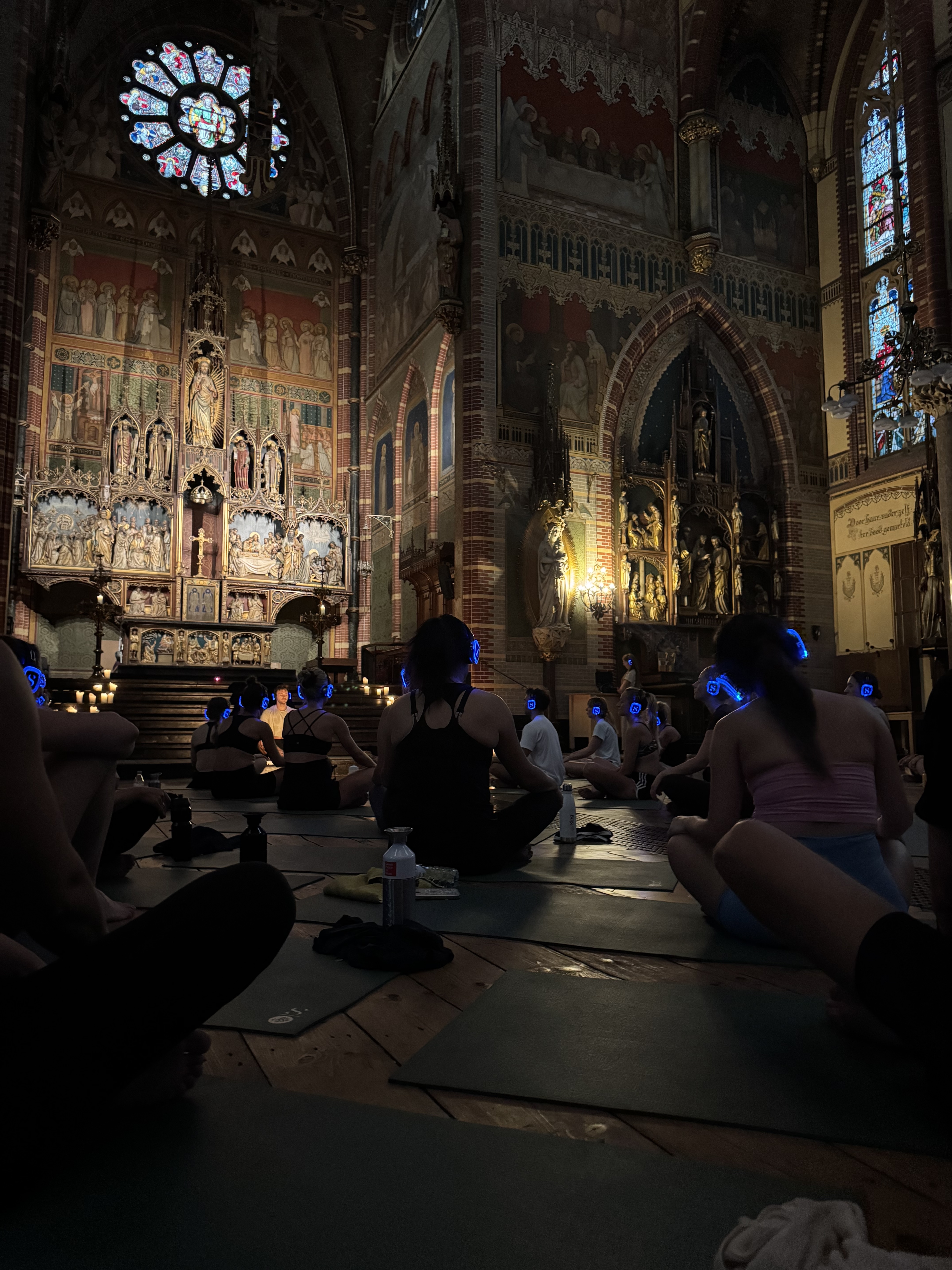
A lovely spot to ponder the nature of the universe (Photo: me)

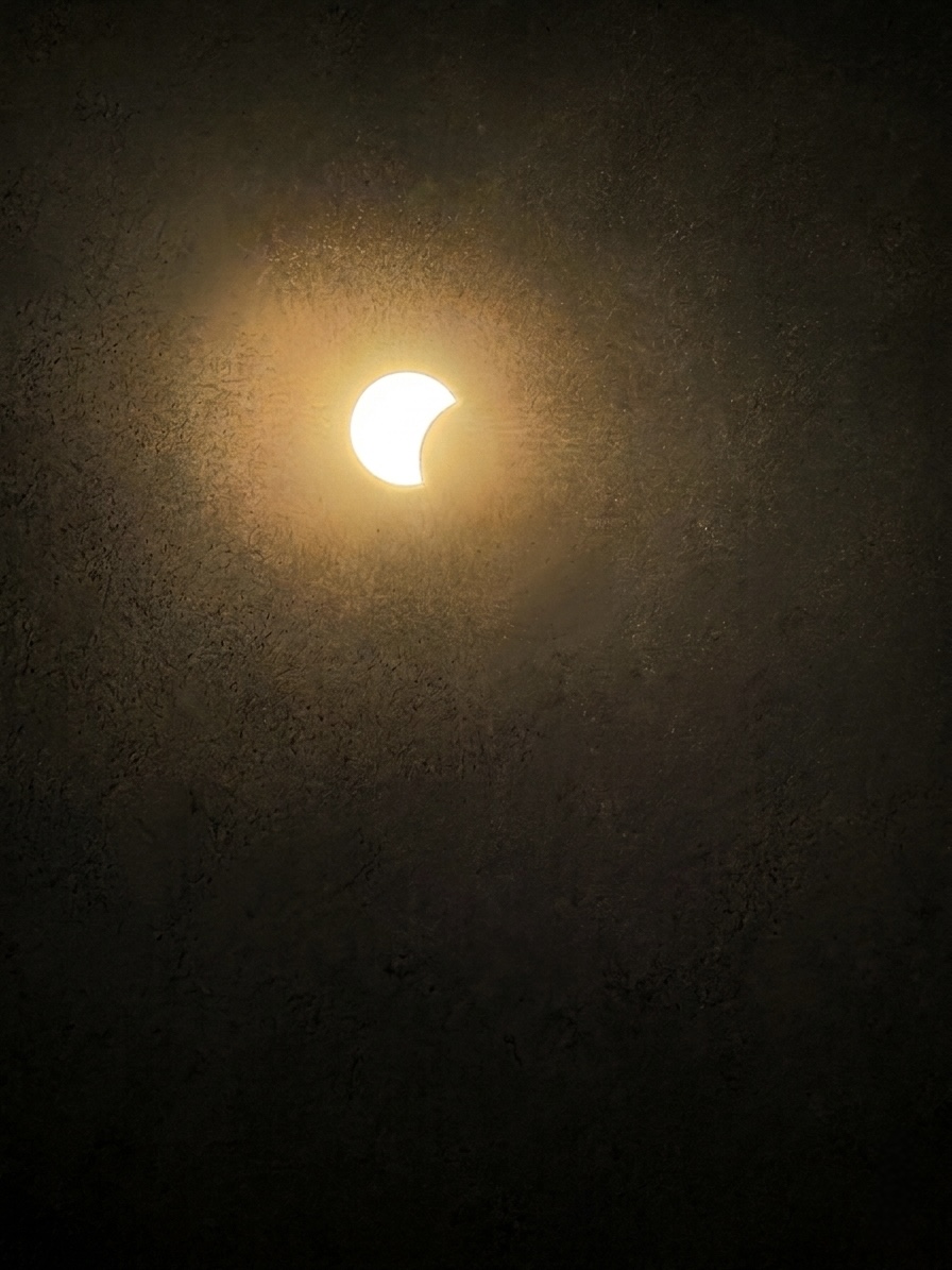
Eighty-eight per cent of the sun went behind the moon on Wednesday and it barely got dark.

That night, every star I looked at turned out to be another sun, filed down by distance to a pinprick. The moon is a rounding error next to the sun. It just happened to be closer, and in exactly the right place to block most of it.

Scale, it turns out, is extremely easy to misunderstand.

Organisations have this problem too. The bigger something gets, the more we tend to discuss it in aggregate: tens of thousands of employees, enterprise-wide adoption, transformation at scale. Eventually the people disappear altogether and you’re left moving percentages around a slide.

Over coffee this week I spent an hour talking through one person’s job. Earlier I’d been on a call about essentially the same problem across an organisation of tens of thousands. The enormous version turned out to contain exactly the same question as the tiny one: what is this person actually trying to do, and what’s getting in their way?

That’s the irritating thing about scale. To understand the big thing, you usually have to get very close to the small one.

The trouble starts when you assume it works the other way round.

This week at work

Over coffee, a friend told me her employer has been telling everyone to use AI. She’s not against it. She just doesn’t know what she’s supposed to do with it. Nobody has said what it’s for.

There is a mandate, and there is a tool, and between them a gap roughly the size of her actual job.

So I did what any normal person does to a friend on their day off and interrogated her about work for an hour.

I didn’t start by asking what she wanted AI to do. I asked what she finds difficult. What’s stopping her being as good at her job as she’d like to be?

Planning, she said.

Her industry works a long way out; she’s on Christmas 2028 at the moment, which is a boggling timescale for me, a person for whom buying food on Sunday for Wednesday constitutes advanced logistics.

The problem isn’t really making the plan. It’s holding the thing together once it exists: knowing where versions have drifted apart, where assumptions no longer match, and where six teams have all independently decided that the same fortnight would be an excellent time to do something enormous.

This is precisely the sort of work computers are annoyingly good at and human brains aren’t. So: give it the plans. Ask it to find inconsistencies, collisions and crunch points.

She said they’re so busy they tend to repeat the things they already know work. Fine. Give it the data from the last few programmes. What performed unusually well or badly? What was different? Are there patterns worth investigating?

Within about twenty minutes we’d gone from I know I’m supposed to use AI but I don’t know what for to a list of things she was genuinely excited to try.

No use-case library. No maturity assessment. No 73-slide deck entitled Unlocking the AI-Powered Future of Work.

We just talked about her job.

Her own takeaway was better than mine. She’s going to ask everyone on her team to bring one thing they’ve used AI for lately that actually made the work better or easier.

Not a strategy. Not a policy. Not a prompt library containing 400 examples nobody will ever read. Just one thing that worked, said out loud, by someone you know and trust, and not some twat from a consultancy who wears a hat indoors.

The funny part is that I’d started the week having essentially the same conversation, only with several more zeroes attached.

I’d been on a call with someone running an AI programme somewhere very large indeed, ahead of a client conversation about what adoption looks like at that scale. And scale changes the conversation surprisingly quickly. One person has a planning problem. Ten thousand people have an adoption strategy.

At organisational scale, everything acquires nouns: Adoption. Enablement. Transformation. Capability. Use cases. You can spend months discussing all of them without getting anywhere near the awkwardly specific question my friend answered over coffee:

What is hard about your job?

Same problem. More zeroes.

The technology isn’t the difficult bit. Finding the useful problem is.

You have to do that first for a person, then for a team, then somehow across tens of thousands of people. And the further you get from the actual work, the easier it becomes to replace understanding it with buying something.

Which is how you end up with an enterprise AI strategy explaining very clearly that everyone should use AI, and an employee sitting in a café saying:

Yes. For what?

Also this week

I took 24 hours off midweek and went to the coast for the eclipse.

First surprise: the Netherlands has genuinely stunning beaches. Huge sweeps of powdery sand running from the dunes straight into the North Sea. The climate makes them properly usable for approximately nine afternoons a year, which may explain why the Dutch have declined to make this a central plank of the national brand.

We got one of the nine.

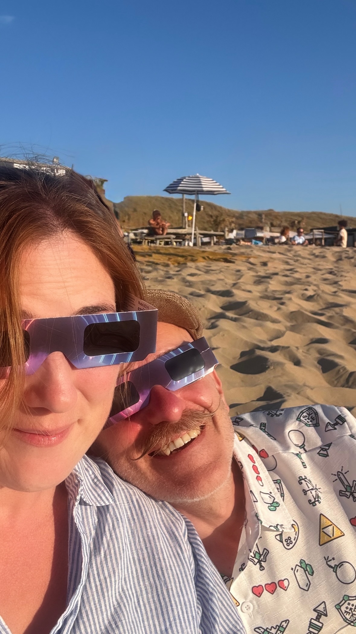
Past me had also had the unusual foresight to book a cabin near the coast and buy eclipse glasses back when they weren’t €20 a pair and being traded with the intensity normally reserved for Taylor Swift tickets and Class A drugs.

We took a couple of bottles of Sol down to the beach, which I’m going to present as thematic intent rather than the consequence of the bar offering a choice between that and Heineken.

At around quarter past seven, through the cardboard glasses, the first bite of the moon appeared at the edge of the sun. Then, very slowly, it ate it.

There’s something profoundly weird about watching celestial mechanics happen in real time. You know perfectly well that the moon goes around the Earth and the Earth goes around the sun. You have presumably known this since primary school. But normally this knowledge sits in the same part of the brain as plate tectonics and the existence of Belgium: accepted as fact, rarely requiring direct confrontation.

Then you watch one enormous object physically move across another and suddenly the solar system stops being a diagram.

What I couldn’t get my head around was the arithmetic of it. The moon is enormous. The sun is so incomprehensibly much more enormous that the comparison is barely useful. And yet from one particular patch of Dutch sand, because of an absurd coincidence of distance and geometry, they looked almost the same size.

At the peak, 88 per cent of the sun was covered. It barely got dark.

That was the bit that broke my brain. You can remove nearly nine-tenths of the thing and the remaining sliver is still bright enough for the world to carry on more or less as normal. The sun, it turns out, is quite a lot of sun.

Later that night I lay in a hammock in the Kennemerland dunes waiting for the Perseids.

The advice for watching a meteor shower is blunt: no screens. Your eyes need around twenty minutes to adjust properly to the dark, and one glance at a bright phone sets you back. This isn’t mindfulness. Nobody is asking you to reconnect with your authentic self or purchase a journal. It’s optics.

So the phone went away.

I live in a well-lit city centre and almost never see stars. Properly see them, I mean. Give your eyes enough darkness and they just keep arriving. A handful becomes dozens, then hundreds, then an absolutely unreasonable number of them.

And having spent the evening staring through cardboard at our sun, I suddenly couldn’t stop thinking about what I was actually looking at.

Every one of those pinpricks is another sun.

Not a decorative light. Not a white dot conveniently provided as background scenery. An actual star: vast and violent and burning away at an incomprehensible distance, reduced by that distance to something I could cover with the tip of my finger.

Then every so often something would tear across the whole lot. A Perseid lasts perhaps a second. A streak, sometimes a flash of colour in the tail, and gone before you’ve quite finished registering it. We’d wait in the dark for another, talking quietly, then one of us would suddenly shout there at a piece of sky the other person was inevitably not looking at.

There are worse ways to spend a night.

I lay there thinking about the scale of all of it: the sun we’d watched disappear behind the moon; the other suns scattered above us; the tiny bits of comet burning up overhead; us underneath, temporarily occupying a couple of hammocks on a sand dune beside the North Sea.

The universe is offensively large.

I found this wonderful.

And then, because apparently even transcendence must eventually become professional development, I realised something mildly embarrassing about my phone.

I’ve written a book about attention and information overload. I talk about this stuff for a living. I know that phones are designed to capture attention. I know that environment beats intention. I know all the arguments.

None of that reliably stops me looking at the bloody thing.

But tell me that one glance at it will ruin my night vision and make me less able to see the meteor shower I came here specifically to see?

Phone in a drawer. For hours. No struggle whatsoever. Turns out I didn’t need better self-control. I needed an immediate and comprehensible consequence.

Design beats willpower. I really, really should know this by now.

Consuming

Two pieces by Oana Leonte, published two days apart, which have been rattling around my head ever since. The first starts with Rick Rubin, who cannot play an instrument or read music, and who told Anderson Cooper that what he’s actually paid for is confidence in his own taste. His contribution to a record is often subtraction: take that out, strip this back, do it again. He has no signature sound because a signature would compete with the judgement.

Leonte uses him to make a distinction I haven’t stopped thinking about: attention is rented; judgement is owned. Attention has to be re-earned every day and returns towards zero the moment you stop feeding it. Judgement compounds. Demonstrate good taste often enough and eventually people trust the verdict — which is why artists at the top of their careers will fly across continents to sit in a room with a man who can’t play a note. They’re not buying his output. They’re buying his judgement.

This is inconveniently at odds with how we measure most things online. We can count impressions, views, followers, clicks and frequency, so we do. Judgement is slower, fuzzier and extremely resistant to dashboards, which means it tends to sit outside the spreadsheet twiddling its thumbs while attention gets all the credit.

Then came part two, prompted by everyone asking how. And she corrects herself: invisibility isn’t the strategy, it’s a by-product. Copy the quiet without the substance underneath it and you’re not cultivating mystique, you’re just a person nobody has heard of. Queen were broke for years being too much for the rooms they were playing. Obscurity is what you pay to get good.

What actually holds is coherence — and here she draws a distinction I’m going to steal wholesale, because half my working life is spent in rooms where coherence and consistency are treated as synonyms. Consistency is surface: same logo, palette, tone, templates, everything governed until no rogue shade of blue can threaten the enterprise. It photographs as discipline and is often just rigidity with a hex code.

Coherence is the sense that the choices belong together, even when they don’t look the same. Consistency asks whether the parts match; coherence asks whether they came from the same place. You can be flawlessly consistent and mean absolutely nothing, which explains an alarming amount of corporate communication.

And then the question I’d put on a poster: would any of this still be standing if you stopped posting tomorrow?

I read all of this while planning a mailing list, a webinar and another run of book promotion, so I’m not claiming any position of moral superiority here. The most coherent thing I did all week was spend several hours in a hammock looking at objects that have existed for billions of years without once publishing a thought-leadership carousel.

Then I came home and wrote about them on the internet. The stars, presumably, remain relaxed about the competition.

Coverage

In.Comms asked five comms pros (including me) whether it’s internal comms’ job to motivate employees. Nobody said yes, which I found reassuring, because we’ve spent far too long accepting accountability for things we have almost no authority over.

Pay. Workload. Leadership. Whether the work itself is any good. Whether your manager is a prick. Motivation is downstream of all of these things, and when they’re not working, asking comms to boost engagement is applying corporate Febreze to a structural problem.

What we can do is help people understand what’s happening, why it matters and where their work fits. What we can’t do is communicate someone into being happy about a job that’s giving them perfectly good reasons not to be. My bit sits alongside Jennifer Sproul, Jo Coxhill, Adeela Warley and Rachel Miller.

Also recorded this week: Jon and I joined Nancy Goebel on DWG’s Digital Impact podcast to talk about designing channels employees actually use — the five layers, why most organisations have a coherence problem rather than a channel problem, and the intranet manager who hit an annual page-view target in 48 hours by leaving fifty browser tabs auto-refreshing.

This is both objectively funny and a near-perfect demonstration of what happens when a metric stops measuring the thing and becomes the thing. Somewhere, a dashboard was green. Everyone could go home.

Out in the autumn, at which point I’ll link it properly.

This week in photos

What Mondo taught me about the future of banking

Mondo are one of the most talked-about new players on the consumer/retail banking block (just this month they reached a $1m crowdfunding target in 96 seconds), so I was delighted to get a place on their Alpha. Here’s a few early thoughts and observations on my experience and what it might signal for the future of FinTech.

It didn’t start well, for me. Specifically, I managed to destroy a coat rack within moments of arriving in their offices, sending a pile of jackets and scarves to the floor. But within half an hour I was up and running with an app and a fluorescent pre-paid Mastercard, ready to take a look at the future of banking.

As a nerdy consumer I’ve been looking at the future of banking for a long time now — I think I got my first online bank account around the turn of the century, which was roughly the time I started earning money. For most part from an experience point of view the future of banking tends to look a lot like other online user experiences did five years previously*.

* Except my bank account in Asia. That’s more like every other user experience in 2001.

So I’d agree this is a market ripe for disruption, and that customer needs are probably better served by attempting to build a new bank from the bottom-up, based around user need, than building marginally nicer front ends for terrible legacy infrastructure.

Mondo is one of a number of UK startups attempting to do that. Fellow challenger Atom has a banking licence, unlike Mondo, but is yet to have a releasable product. Mondo is taking the reverse tack, developing its app-based bank in public, offering a pre-paid card to several thousand Alpha users and asking for feedback, while working with regulators behind the scenes on getting their banking licence.

I’ve seen the future. It’s pink with a liberal sprinkling of emoji.

Mondo is, in short, a card and an app, with ambitions to turn this into a full service retail bank in time. The app itself is neat; every time I use the card, I get an alert on Mondo, replete with carefully-chosen emoji, before the sales assistant has printed the receipt. These guys must spend a scary amount of time choosing emoji.

It’s a pre-paid, luminous pink Mastercard, and while topping up is simple this does limit its usefulness as there’s no auto top-up option. I was about to pay for a few things at the weekend but only had £20 left on the card; as Hammersmith is a weird mobile phone coverage blackspot I couldn’t add money to it, and had to fall back on my regular debit card. It doesn’t yet work with ApplePay, but the team have said this is on its way.

As it’s linked to your phone, it’s smart enough to work out where you are and how this might impact your spending. If you’re in Singapore and but your card’s being used in Swansea, it can let you know immediately. Which is refreshing change from ham-fistededly blocking your card every time you travel.

The app makes it easy to see what I’ve spent by vendor and category, and gives me the option of adding tags, notes, receipt images and so on to each transaction. It’s easy to see my balance and spending at a glance. A particularly nice feature is the ability to freeze the card when you can’t find it, and unfreeze again when found — rather than the big banks’ standard option of cancelling the card and waiting a long, cashless, cardless week to have a new one sent through the post.

And these are all great features. In fact, if I were my flaky 21-year-old self — on a tight budget and prone to losing my cards — the features offered by Mondo would easily tempt me to switch to it as my main vehicle for day-to-day spending.

But I am not 21. While Mondo does give me a vague sense of guilt over my cumulative spend in sandwich chains, I’m at a point in my life where I’m lucky enough not to be too concerned about £10 spent on wine or nail polish. My digital banking needs are different now I’m a proper grown-up.

I have savings. I’d like to have more savings, and I’d like my bank to help me to make saving a habit rather than an afterthought. Knowing I spent £6.38 on juice and yoghurt is all well and good, but if my bank could tell me, at the right time, that if I bought fewer cakes I could pay my mortgage off two months earlier, that’s useful to me.

I like data, but for my accounts data to work for me I need to be able to see it in one place, and I need it to be interoperable. Spend-specific emojis make me smile, but I can’t use them to reconcile transactions in my freelancer accounting software. My regular bank account has an API and allows me to download transaction data so I can interrogate it.

I also like free stuff. I chose my bank account when I began university, because they gave me a hefty fee-free overdraft and a student railcard. Like most people I have never bothered to change my bank account since. These days I have a reasonable credit rating and a taste for far-flung destinations, so I do all my spending via my credit card in order to build up airline points. A year’s worth of hotel bills, work expenses and pub visits were enough to get me two free flights via my credit card’s reward scheme. I’m willing to put up with some seriously bad UX in return for a free holiday.

Banks for brogrammers, by brogrammers

I like Mondo, and I like what they’re trying to do. What they do, they doreally well. For payments and day-to-day usage, its UI, UX and FX is streets ahead of my high street bank.

But right now it isn’t enough to make it my everyday bank, because it doesn’t (yet) meet my needs as a solvent thirty-something woman.

In that respect, it’s not so different from other startups, very many of which have cropped up to solve the problems of the unrepresentative sample of people who build apps. From Uber to Airbnb to laundry pick-up and gas delivery services, Silicon Valley et al are focused on solving problems faced by people like themselves.

To be fair to Mondo, they have at least recognised this and sought to get more women on their Alpha in order to get a wider range of feedback. But if any company truly wants to transform its sector, it needs to solve the problems of a full cross-sector of consumers. Elderly ones with rubbish phones and failing eyesight. Poor, underbanked ones. Even boring ones like me with low-risk investment needs and unsexy pension arrangements.

As my 300 Seconds co-founder Hadley Beeman said at our opening event three years ago, if we want to change the world, we need a good cross-section of humanity to be involved at every stage — to articulate their user needs, and develop products to meet those needs.

If you want to change banking, you need to solve for more than coffee budgeting.

Banking is a fully digitisable business. In a business which doesn’t deal in tangible things trust is critical. This gives traditional banks a major advantage; most people prefer to entrust their money to an FSCS-backed institution than a startup.

My short experiment with Mondo has shown how quickly a challenger bank can win the user experience battle. While my high street bank has the edge in terms of both functionality and trust for now, challengers are engaging with regulators and fast catching up.

Where traditional banks can maintain an edge is their knowledge of and relationships with a much broader range of customers, recognising that customers don’t just need an app, but a range of products and services to meet their diverse needs at different life stages. Banks have access to a wealth of data on customer behaviour and needs that they could use to develop smarter, easier solutions for customers.

Yet right now neither side seems to be getting it quite right. Startups are focused on solving too narrow a set of user needs to serve the mass market, while traditional banks are attempting to make old systems and structures deliver better digital experiences and coming up short, and resting on their laurels in the hope customers are too lazy or untrusting to try the competition.

Trust in banking and finance continues to lag far behind that of technology firms. Startups are rapidly breaking down regulatory obstacles, gaining consumer trust and building brand recognition. While what Mondo et al haven’t yet got a strong enough product to make me ditch my bank, if they can beef up their offering and combine this with quality user experience, they’ll get my money soon.

Reflections on UX Camp London (#uxcl13)

I recently heard user experience described as the “joy of use”. But all too often, that’s tolerance at best – and more often, discontentment.

Marshall McLuhan famously wrote the medium is the message. In digital, the message – content – is inseparable from the full experience of using the site, the medium. However good the content, the end user’s impression is how both the content, and the medium that delivered it, made them feel. That means there’s a symbiotic relationship between content and the structure, design, information architecture, navigation, and anything that contributes to the joy – or otherwise – of interacting with a site.

So this weekend I took myself along to UXCampLondon, a one-day unconference for those interested in user experience.

UX Camp London

Here’s my highlights:

Bringing human emotions into habitual micro-interactions

The two brothers behind Brighton-based agency Ribot kicked off with an opening keynote on habitual micro-interactions – those regular online habits, which give some type of reward (such as Facebook or Foursquare checkins).

These are often of limited appeal, mostly to Quantified Self nerds like me, who see the data itself (and associated bragging rights) as reward enough. But for an app to gain traction, it needs to offer the user more – it needs to recognise the value of human emotion.

Antony Ribot began by talking about the Nike+ Fuel Band, a personal activity tracker that he’s clearly a big fan of. It rewards the user with praise and recognition when they achieve successive episodes of above-target activity. But as Ribot pointed out, when you need feedback from the app is not when you’re already doing well, but when you’re close to failing, and need a reminder to spur you on to meet your goal.

While Nike+ is a great app, by focusing only on success, it fails you when you need it most. Ribot noted that when he missed a day, the app didn’t remind him. It simply re-set, as if his successful streak had never happened. He was back to square one, sending him into a kind of Nike+ tantrum, disengaged with both the app and his exercise regime.

This was a funny (if long-winded) reminder that the focus of user experience design is not design, but users – real humans with real emotions and foibles.

So Ribot made human emotion central to the iOS app they’ve created for coffee chain Harris + Hoole. This loyalty app allows users create a profile, including uploading a photo and details of their favourite coffee (‘my usual’).
When the user checks in using their handset at a branch of H+H the server will identify them in the queue from their photo, be able to address them by their first name and ask  “your usual?”.  Users can collect loyalty points via the app, and there are plans afoot to add payment functionality.

Aside from the obvious concerns about this being creepy and overfriendly, what’s interesting about this app is that the technology supports – but takes a back seat to – customer experience. The app provides something more than the social currency of a Facebook checkin, by layering this in to real-life customer interaction that feels warmer and more personal.

Whatever your thoughts on sharing your name, photo, location and coffee preferences with an ‘independent’ chain that’s 49% owned by Tesco, the H+H app is an impressive example of how to inject better emotional design into apps and online experiences.

This set the tone for the rest of the day, a fascinating insight into the many and varied elements that contribute to the joy (or pain) of using a website.

Simplifying the UI to improve conversion

Paola began by describing a familiar problem; an e-commerce design that’s expanded rapidly finds they have a lack of consistency in page elements, like buttons and labelling. In fact, on this site half of the front page elements were for SEO purposes only, and they have multiple product managers and departments managing the page.

There followed a textbook example of how to do a UX redesign.

  • Had 40 multivariant tests running on the homepage at all times
  • Did an audit of the site. Printed screenshots of inconsistent elements and showed the sheet volume to stakeholders to highlight the extent of the problem
  • Created a persona. Lucy represented different customer ‘modes’, such as researching, price comparing, booking, etc. Lucy was frequently referred to in workshops (“what about Lucy? All she wants to do is book”)
  • Developed a plan setting out how create consistency on buttons, next steps, location of information, etc

Once Paola had scoped the problem and solution, she sold the need for simplification to the business by emphasising the benefits in simplifying updates as well as improving customer experience (in turn, increasing conversion).

…or rather, it would have been a textbook example, if hotels.com had implemented the changes. But they haven’t yet, because of the way the site is managed. And that, my friends, is why getting your site governance right is essential.

Redesigning the comic book for the digital native form

A chance corridor conversation led me to attend a session on comics next. To say this is an unlikely choice for me is an understatement; I just don’t get the appeal of comics.

I’m very glad I did. Katan led a a fascinating discussion on reinventing the comic book for the digital age. Comics are currently where sales catalogues were in 1999, with producers putting barely-changed versions of their print design online.

That, explained Katan, is a huge missed opportunity. Digital native display of sequential art should not mean animation of flat art. To truly embrace the potential of the online form, they need to move to a display which is multi-layered and non-linear, taking full advantage of hypertextuality to give a richer experience of going back and forth in time, or between elements of the story.

Katan is working on an ambitious project, called CAPOW, which creates both a workflow system for the various artists who contribute to a comic, and a content management system that will allow for a responsive reflow of panels across screen sizes, and enable better publication of non-linear visual stories (what Scott McCloud calls the “infinite canvas”)

While I’m still not likely to buy a comic, I found this a really inspiring session; it’s left me thinking about other publications which are trapped in a presentation form from a pre-digital age, and how they can be reinvented.

Sketchnoting workshop

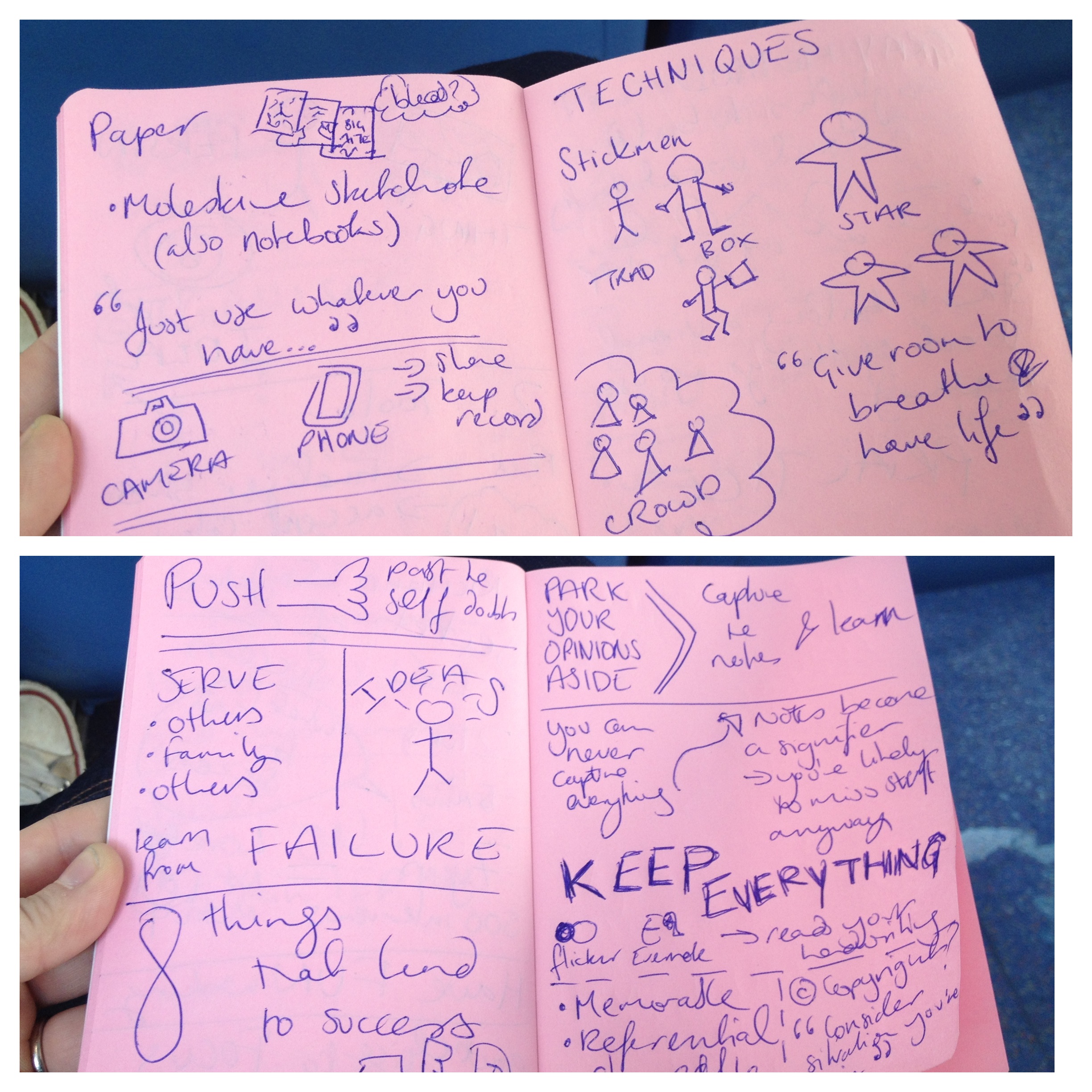
Sketchnoting is a style of visual note-taking that has become hugely popular at tech conferences in the past few years. I first became aware of it when I spoke at Intranatverk earlier this year, where Francis Rowland did sketchnotes of each of the talks, including mine.

Sketchnoting

I’ve seen a bunch of other sketchnotes since, but not been tempted to begin using the technique myself as I cannot draw (At all. Really, I’m terrible at it). But when I spotted there was a workshop on it at UXCamp, I was keen to go along and find out more about it.

The session was led by Information Architect Boon Yew Chew, who uses sketchnoting as a regular technique in his work. He gave an overview of the key tools and techniques, including how to capture the key points and (usefully for me) why an inability to draw need be no barrier to taking sketchnotes.

He then challenged us to give it a go, taking notes on a short TED talk.  The photo above shows my efforts. It turned out better than I expected, and is a technique I’m going to practice a little. Boon gave me a copy of Mike Rohde’s Sketchnoting Handbook, which I’m already using to try and learn the techniques and structures.

Overall impressions

This was the first time I’ve been to UXCamp London, and overall found it worthwhile and useful event, with a good mix of talks on widely varying topics.

It could have done with more people running sessions, as at a couple of points there were only two or three to choose from, which were very overcrowded as a result. But it was very refreshing to see that women made up around half of those attending, and running sessions. And at only a tenner including lunch, it was remarkably good value too.

I’d encourage anyone with an interest in UX to attend in future years (or months – there’s a UX Camp Brighton coming up in November).