I recently heard user experience described as the “joy of use”. But all too often, that’s tolerance at best – and more often, discontentment.
Marshall McLuhan famously wrote the medium is the message. In digital, the message – content – is inseparable from the full experience of using the site, the medium. However good the content, the end user’s impression is how both the content, and the medium that delivered it, made them feel. That means there’s a symbiotic relationship between content and the structure, design, information architecture, navigation, and anything that contributes to the joy – or otherwise – of interacting with a site.
So this weekend I took myself along to UXCampLondon, a one-day unconference for those interested in user experience.

Here’s my highlights:
Bringing human emotions into habitual micro-interactions
The two brothers behind Brighton-based agency Ribot kicked off with an opening keynote on habitual micro-interactions – those regular online habits, which give some type of reward (such as Facebook or Foursquare checkins).
These are often of limited appeal, mostly to Quantified Self nerds like me, who see the data itself (and associated bragging rights) as reward enough. But for an app to gain traction, it needs to offer the user more – it needs to recognise the value of human emotion.
Antony Ribot began by talking about the Nike+ Fuel Band, a personal activity tracker that he’s clearly a big fan of. It rewards the user with praise and recognition when they achieve successive episodes of above-target activity. But as Ribot pointed out, when you need feedback from the app is not when you’re already doing well, but when you’re close to failing, and need a reminder to spur you on to meet your goal.
While Nike+ is a great app, by focusing only on success, it fails you when you need it most. Ribot noted that when he missed a day, the app didn’t remind him. It simply re-set, as if his successful streak had never happened. He was back to square one, sending him into a kind of Nike+ tantrum, disengaged with both the app and his exercise regime.
This was a funny (if long-winded) reminder that the focus of user experience design is not design, but users – real humans with real emotions and foibles.
 So Ribot made human emotion central to the iOS app they’ve created for coffee chain Harris + Hoole. This loyalty app allows users create a profile, including uploading a photo and details of their favourite coffee (‘my usual’).
When the user checks in using their handset at a branch of H+H the server will identify them in the queue from their photo, be able to address them by their first name and ask “your usual?”. Users can collect loyalty points via the app, and there are plans afoot to add payment functionality.
Aside from the obvious concerns about this being creepy and overfriendly, what’s interesting about this app is that the technology supports – but takes a back seat to – customer experience. The app provides something more than the social currency of a Facebook checkin, by layering this in to real-life customer interaction that feels warmer and more personal.
Whatever your thoughts on sharing your name, photo, location and coffee preferences with an ‘independent’ chain that’s 49% owned by Tesco, the H+H app is an impressive example of how to inject better emotional design into apps and online experiences.
This set the tone for the rest of the day, a fascinating insight into the many and varied elements that contribute to the joy (or pain) of using a website.
Simplifying the UI to improve conversion
Paola began by describing a familiar problem; an e-commerce design that’s expanded rapidly finds they have a lack of consistency in page elements, like buttons and labelling. In fact, on this site half of the front page elements were for SEO purposes only, and they have multiple product managers and departments managing the page.
There followed a textbook example of how to do a UX redesign.
- Had 40 multivariant tests running on the homepage at all times
- Did an audit of the site. Printed screenshots of inconsistent elements and showed the sheet volume to stakeholders to highlight the extent of the problem
- Created a persona. Lucy represented different customer ‘modes’, such as researching, price comparing, booking, etc. Lucy was frequently referred to in workshops (“what about Lucy? All she wants to do is book”)
- Developed a plan setting out how create consistency on buttons, next steps, location of information, etc
Once Paola had scoped the problem and solution, she sold the need for simplification to the business by emphasising the benefits in simplifying updates as well as improving customer experience (in turn, increasing conversion).
…or rather, it would have been a textbook example, if hotels.com had implemented the changes. But they haven’t yet, because of the way the site is managed. And that, my friends, is why getting your site governance right is essential.
Redesigning the comic book for the digital native form
A chance corridor conversation led me to attend a session on comics next. To say this is an unlikely choice for me is an understatement; I just don’t get the appeal of comics.
I’m very glad I did. Katan led a a fascinating discussion on reinventing the comic book for the digital age. Comics are currently where sales catalogues were in 1999, with producers putting barely-changed versions of their print design online.
That, explained Katan, is a huge missed opportunity. Digital native display of sequential art should not mean animation of flat art. To truly embrace the potential of the online form, they need to move to a display which is multi-layered and non-linear, taking full advantage of hypertextuality to give a richer experience of going back and forth in time, or between elements of the story.
Katan is working on an ambitious project, called CAPOW, which creates both a workflow system for the various artists who contribute to a comic, and a content management system that will allow for a responsive reflow of panels across screen sizes, and enable better publication of non-linear visual stories (what Scott McCloud calls the “infinite canvas”)
While I’m still not likely to buy a comic, I found this a really inspiring session; it’s left me thinking about other publications which are trapped in a presentation form from a pre-digital age, and how they can be reinvented.
Sketchnoting workshop
Sketchnoting is a style of visual note-taking that has become hugely popular at tech conferences in the past few years. I first became aware of it when I spoke at Intranatverk earlier this year, where Francis Rowland did sketchnotes of each of the talks, including mine.
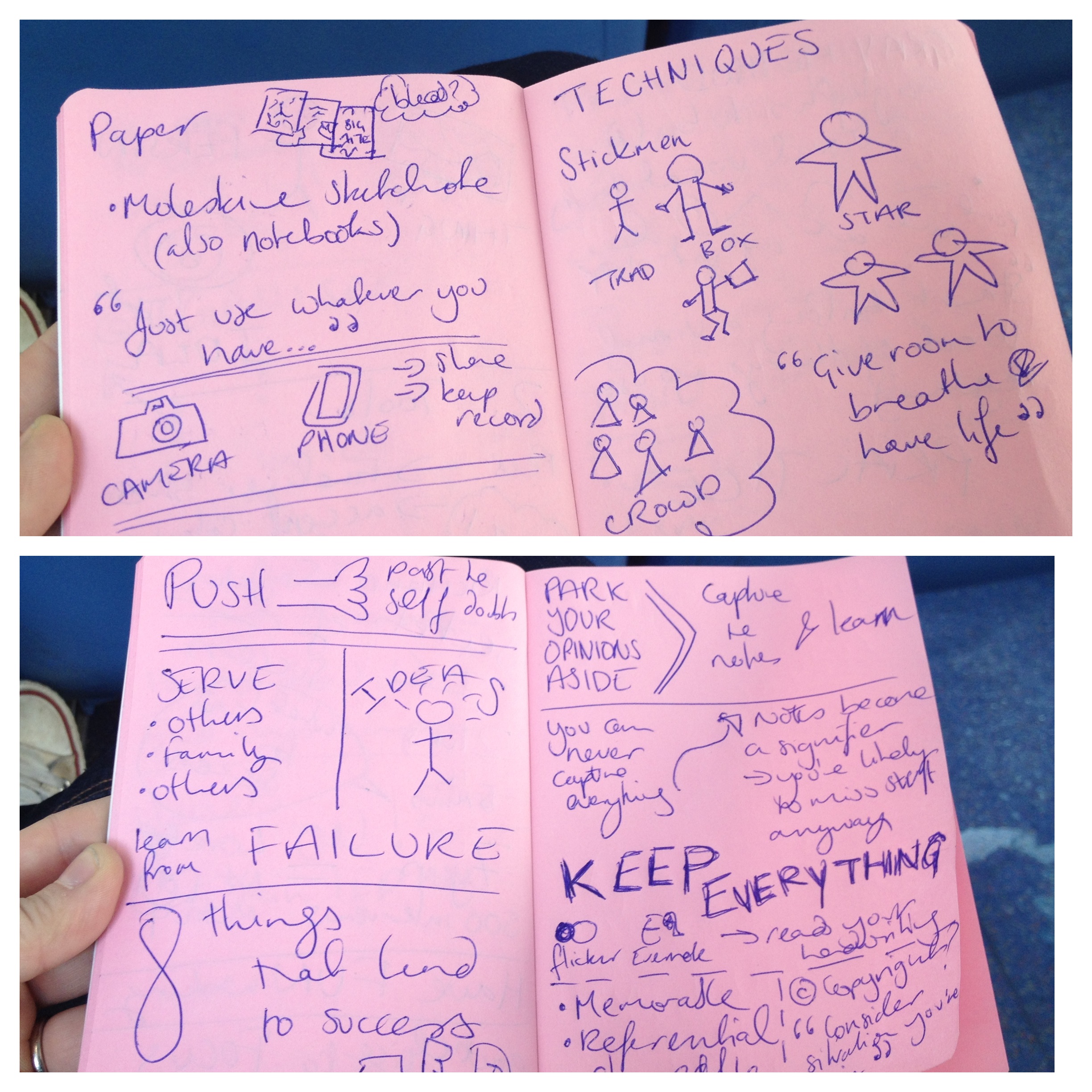
I’ve seen a bunch of other sketchnotes since, but not been tempted to begin using the technique myself as I cannot draw (At all. Really, I’m terrible at it). But when I spotted there was a workshop on it at UXCamp, I was keen to go along and find out more about it.
The session was led by Information Architect Boon Yew Chew, who uses sketchnoting as a regular technique in his work. He gave an overview of the key tools and techniques, including how to capture the key points and (usefully for me) why an inability to draw need be no barrier to taking sketchnotes.
He then challenged us to give it a go, taking notes on a short TED talk. The photo above shows my efforts. It turned out better than I expected, and is a technique I’m going to practice a little. Boon gave me a copy of Mike Rohde’s Sketchnoting Handbook, which I’m already using to try and learn the techniques and structures.
Overall impressions
This was the first time I’ve been to UXCamp London, and overall found it worthwhile and useful event, with a good mix of talks on widely varying topics.
It could have done with more people running sessions, as at a couple of points there were only two or three to choose from, which were very overcrowded as a result. But it was very refreshing to see that women made up around half of those attending, and running sessions. And at only a tenner including lunch, it was remarkably good value too.
I’d encourage anyone with an interest in UX to attend in future years (or months – there’s a UX Camp Brighton coming up in November).
Pingback: Reflections on UX Camp London (#uxcl13) – Sharon O’Dea | Public Sector Blogs
Pingback: Link roundup | Kind of Digital