The record without the reasoning

Surrealist painting of a wide steel filing cabinet drawer floating unsupported against a blue sky with scattered white clouds. Inside, a neat row of buff-coloured file folders has large rectangular sections cut away, revealing the same cloud-filled sky through the empty spaces.

Somewhere in your organisation there is a decision that everyone works around and nobody can explain.

It might be a field on a form that absolutely has to be filled in. An approval that must come from one particular team. A platform choice that constrains six other things. A rule about who can publish where. Something mildly annoying, surprisingly consequential and apparently ordained by God.

Ask why and you’ll get a shrug and a name, usually the name of someone who left in 2021.

The decision itself is in the record. It’s probably in several records. There’s a PowerPoint about it. A Teams thread. A project page nobody has looked at since launch. Possibly a PDF called FINAL_v7_APPROVED tucked lovingly into SharePoint.

What isn’t in any of them is the useful bit: why.

What trade-off was being made. What constraint applied at the time. What other option was considered and rejected. Whose objection was overruled and on what grounds. Which apparently permanent principle was, in reality, “we had £40k left in the budget and it’s use it or lose it.”

That part existed for about a fortnight, in the heads of four people and a meeting that wasn’t minuted properly, and then it evaporated.

This is something I think internal communicators — and anyone responsible for the digital workplace — need to take much more seriously.

We’ve spent fifteen years making work more findable, but we have not made it any more explicable.

Those are quite different problems. Worse, solving the first has made it easier to ignore the second, because a beautifully indexed archive of outcomes looks so much like organisational memory that we kinda stop noticing it isn’t.

Why the reasoning goes first

Every organisation loses knowledge. What’s less obvious is that it loses it in a pretty predictable order.

The decision survives because it has to. Someone needs to act on it, so eventually it becomes a policy, a configuration, a process map, a field marked mandatory.

The artefacts survive too. The deck. The paper. The approval email. The minutes saying “the group agreed to proceed with option B.”

What disappears first is the reasoning, and there are three mundane reasons for that:

The first is that reasoning is the only part that feels unnecessary to record at the time. When you’re in the middle of a decision, the logic is so obvious that writing it down feels faintly ridiculous. Of course we’re doing it this way. Everyone knows why.

The problem is that “everyone” is a group with an aggressive rate of attrition. Four years later, half of them have left, one has changed role twice, nobody can remember which supplier caused the problem, and a new person is staring at the resulting process wondering why on earth anyone would design it like this.

The second reason is that the reasoning is often awkward, embarassing even.

Real decisions are made under constraints. Budgets. Politics. Supplier relationships. Deadlines. Personal preferences. Compromises. A senior person who really, really liked option B.

None of this looks at all elegant six months later, so the rough edges get sanded off. What enters the official record is a rationale: tidy, retrospective and strategically aligned.

What happened was reasoning: contingent, human, occasionally embarrassing and considerably more useful.

And then there’s memory itself.

Six months later, ask the people involved why they made the decision and they will generally give you an answer. They’ll probably believe it, too. Humans are extremely good at constructing coherent explanations backwards from outcomes.

Which means there is a fairly short window in which you can capture why something actually happened. Miss it and you don’t preserve the reasoning later. You preserve a plausible replacement.

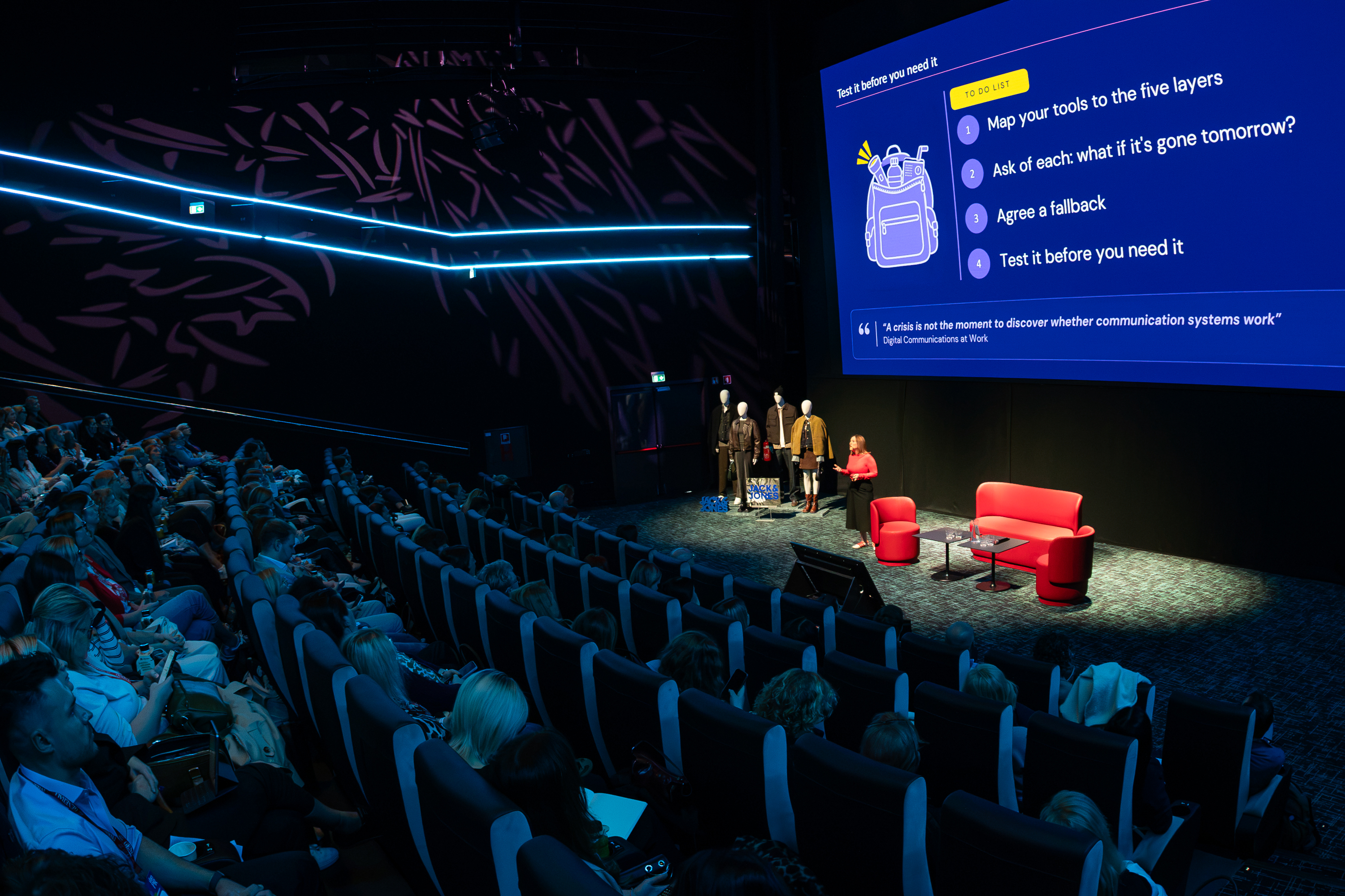
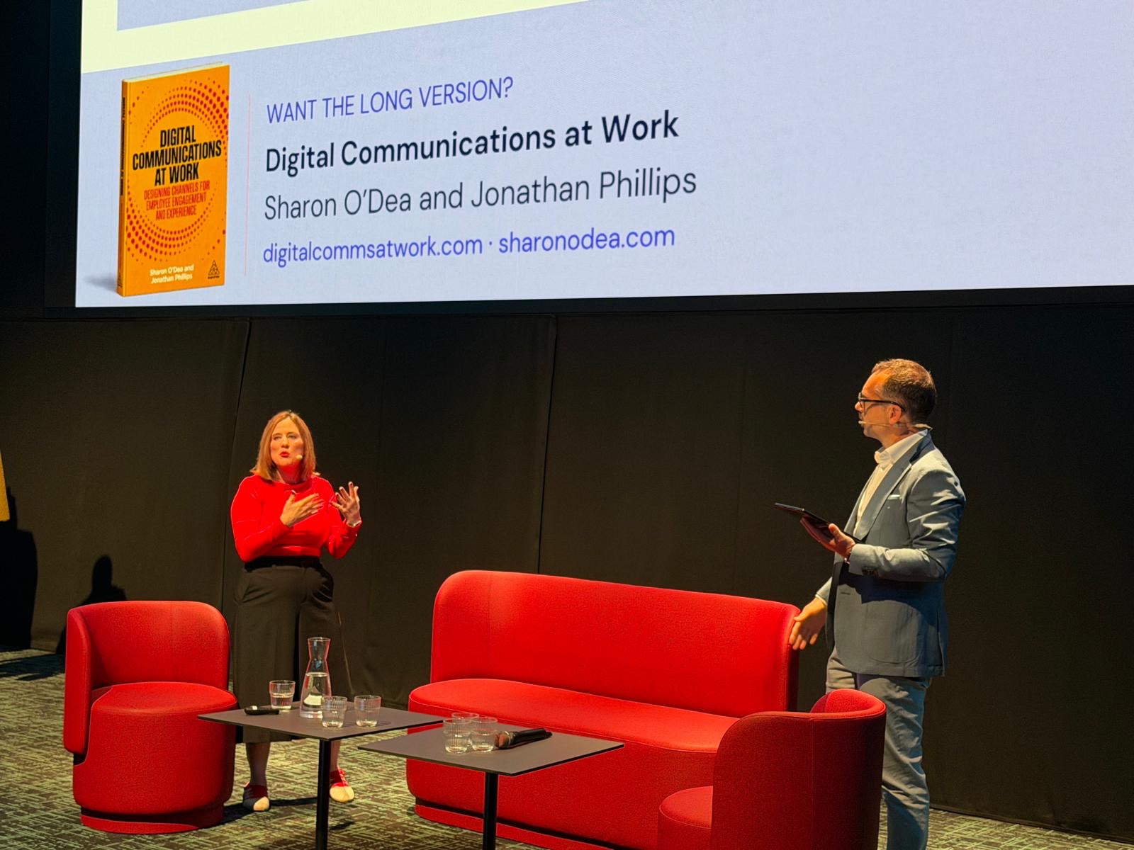
We touched on this in Digital Communications at Work as “shrinking organisational memory”, alongside hybrid working patterns and rising employee expectations as conditions tightening around communicators.

I’ve come to think this one has the longest tail. Hybrid arrangements will settle into something. Organisational memory won’t magically improve, because almost nothing in the way we’ve designed modern work is intended to preserve it.

Quite the opposite.

The expensive consequences of forgetting why

None of this appears as a line item in a budget, which is convenient, because it costs organisations a fortune.

Decisions become permanent by accident.

A decision with a recorded reason can be revisited. You look at the original constraint, ask whether it still applies and, if it doesn’t, change your mind.

A decision without a recorded reason has only two possible statuses: permanent or arbitrary. Neither is terribly useful.

In practice, organisations tend to choose permanent, because overturning something when you can’t explain why it exists feels reckless. So temporary constraints acquire the status of ancient law.

This is how you end up with an intranet governed in 2026 by the ghost of a licensing arrangement that expired in 2019.

Platform decisions are often driven by a single technical constraint: it has to be SharePoint, because…

The “because” deserves far more scrutiny than it usually gets. But if nobody writes the “because” down, three years later there is nothing to scrutinise. The organisation inherits the conclusion, assumes some clever person once had an excellent reason for it, and carries on.

It’s an extraordinarily efficient mechanism for turning temporary compromises into strategy.

New people can’t learn from the record

“We decided X” teaches you nothing.

Onboarding someone properly into a function is largely about teaching them the shape of decisions already made: why things work the way they do, which obvious alternatives have been tried before, where the bodies are buried and which bits of received wisdom are still true.

If none of that exists in the record, it has to be transmitted person-to-person.

Organisational knowledge then moves at the speed of coffee. And worse, it only reaches people who get invited for one.

This is one reason informal networks matter so much more inside organisations than org charts suggest. The person who knows why the process is like that becomes part of the infrastructure. Lose them and you haven’t just lost a person. You’ve deleted part of the manual.

Discovery becomes archaeology

When I go into an organisation to work out what’s actually wrong with its internal comms or digital workplace, a surprising amount of the work is reconstructing why the system looks like this in the first place.

Why are there three intranets? Why does this team own that channel? Why is this audience excluded? Why is everyone still producing a weekly PDF? Why is there a separate platform for seventeen people in Belgium?

Sometimes the archaeology is the discovery. The reason something happened five years ago turns out to explain a great deal about why it isn’t working now.

But it’s slow. And there is something a little absurd about paying an outside consultant to interview twelve people in order to reconstruct a decision your own organisation made.

Teams with decent decision records get to spend that time solving the current problem instead.

Please don’t create another database

The obvious response to this is to write a policy saying decisions must be documented. But really, please don’t.

“Document decisions” already appears in thousands of governance frameworks, where it sits alongside “ensure stakeholder alignment” and other phrases that are technically instructions but provide no clue what anybody should actually do.

It fails because it has no threshold, no format and no home, and in the real world, where I am forced to live, you need all three.

Set a threshold

Don’t document everything. That’s how you create another repository everyone resents.

Instead, record the reasoning behind decisions that will outlive the person making them, cost money or credibility to reverse, or constrain somebody else’s choices later.

That’s a much smaller number than it sounds. For most communications and digital workplace teams, you’re probably talking about a handful a quarter.

It also gives everyone permission not to document the other 97% of things they currently feel vaguely guilty about.

Give the record a fixed shape

Four lines will do it:

  • What we decided
  • What we chose it over
  • What made the difference
  • What would make us revisit this

That last line is the clever bit.

It turns a historical record into something useful. Whoever inherits the decision knows not only why it was made, but under what circumstances they have permission to change it.

It also improves the decision itself. A room full of people forced to answer “what would make us revisit this?” has to confront how certain it actually is.

“We will never reconsider this” sounds considerably sillier when someone has to type it into a box.

Put the reasoning next to the thing it explains

The most reliable way to lose a decision record is to create a dedicated Decision Log in a worthy corner of SharePoint and announce its existence in Teams.

Six months later it will contain eleven decisions, seven made by the person who created it.

Reasoning needs to live with the thing it explains: in the governance space where the platform decision sits, in the channel framework, in the standing papers for the group that made the call.

In Digital Communications at Work we describe programme governance as needing “just enough structure”: a steering group, a standing agenda, records that are actually kept and remain visible.

Most organisations already have somewhere this could live.

You almost certainly don’t need another tool.

One of the counterintuitive benefits of doing this properly is that you can actually write less down.

Teams that don’t capture the why tend to compensate by capturing everything else. Status updates. Meeting recaps. Partial summaries. Deck after deck explaining where we’ve got to, because nobody is entirely confident that the important thing has been retained.

Four honest lines about an actual decision can replace an awful lot of anxious documentation.

And a note on ownership: this isn’t a communications job in the sense that comms should become the organisation’s official minute-taker. It is a communications job in the sense that communications people are often among the few who sit across enough of the organisation to notice when a decision has gone feral and nobody can account for it.

That’s an argument for a seat at the governance table, not for taking the minutes.

And now we’re making the archive intelligent

There is one reason this perennial problem has suddenly become more urgent.

Until recently, people wrote things down on the assumption that the record was essentially inert. Yes, the organisation retained it. Yes, technically someone might find it. Yes, lawyers occasionally appeared carrying the word “discovery” when someone uses a DSAR as leverage.

But most of the time, the Teams chat you wrote in 2022 sat on a server doing nothing.

That assumption is disappearing.

I wrote about this recently for Reworked, prompted by the proposed sale of Spirit Airlines’ workplace data during its bankruptcy. The interesting thing about that story wasn’t simply that workplace messages had survived. We always knew they did.

It was that the archive had acquired value in its own right.

Emails, chats, documents and other traces of organisational life aren’t just records any more. They’re material that can be searched, analysed, synthesised and used to teach machines something about how organisations actually work.

Which creates an tricky tension.

At precisely the moment technology is becoming extraordinarily good at reading the organisational record, humans have more reason to be cautious about what they put into it.

You don’t have to believe your company’s Teams archive is going to be sold in a bankruptcy auction for that to change behaviour. You only have to think your colleagues believe their words may eventually be read by audiences they cannot currently imagine.

And people won’t respond by writing nothing down. They’ll do something much more rational. They’ll keep recording the decision. The project update. The agreed position. The clean version.

What they’ll become less inclined to record is the messy, contingent, human explanation of why one option won and another didn’t.

The politics. The uncertainty. The compromise. The constraint. The thing everyone in the room understood but nobody particularly wants appearing in an AI-generated summary three years from now.

In other words, exactly the part of organisational memory that was already starting to disappear.

That, my friends, is the paradox.

We’re building tools capable of searching almost everything an organisation has ever written at the same time as we’re creating stronger incentives for people not to write down the bits that would make the archive genuinely useful.

The result may be organisations with an almost perfect record of what they did and progressively less idea why they did it.

A decade of impeccably searchable history and no memory at all.

And it won’t happen because somebody forgot to switch on retention.

It’ll happen one perfectly sensible individual decision at a time.

I help organisations — usually large, usually complicated, often regulated — work out what their communication system is actually doing and how to make it hold together. That’s the work I do through Lithos Partners. If any of the above sounded uncomfortably familiar, get in touch.

Weeknote 2026/35

Pre-festival dog walks (Photo: me)

“If you want the rainbow, you gotta put up with the rain,” said Dolly Parton.

It absolutely pissed down at Forwards on Saturday.

Proper, committed rain. The sort where you spend the first twenty minutes trying to preserve some vestige of dignity before accepting that your hair is fucked, your shoes are wet and this is simply your life now. At which point, pleasingly, it becomes fun. I put my raincoat on and danced like an absolute twat and it was brilliant.

This week bought the sad news that Dolly died, and I spent much of the following two days listening to her music and having a bit of a cry. So the quote has been rattling around my head ever since.

It also turns out to be a reasonably good description of running a small consultancy.

The rainbow is the bit you get to announce: we won a new client. We ran a great session. We wrote something people wanted to read. The rain is contract negotiation, procurement portals, pitch decks for meetings that get postponed, timesheets, project plans, pipeline reviews and writing a scope annex whose principal purpose is to establish, at considerable length, all the things you are not going to do.

We tend to talk about work in terms of its outputs because those are the bits you can see. Projects delivered. Decisions made. Things launched. But underneath them is an enormous amount of preparation, negotiation, context and maintenance: the work behind the work.

Most weeks, you don’t notice it particularly.

This week, there was rather a lot of rain.

This week at work

We won a new client this week. Open tender, decision faster than expected, and we’re very pleased about it.

Winning it immediately produced a full day of contract negotiation, a scope annex written from scratch to define all the things we weren’t doing, and a compliance process that ran first into a legal team needing ten working days and then into our client contact going on annual leave. None of this is billable. All of it has to happen before the billable work can begin.

The same week, we spent two days preparing for a pitch. Deck built, case studies chosen, argument sharpened, review session with someone who knows the target organisation well. The session was postponed the day before it was due to happen. It’s been rescheduled, which is the good version of this outcome. The two days don’t come back either way.

Around that: proposal responses, project plans, timesheets, finances, contracts, and a full pass over every live and prospective piece of work on the board. All necessary. None billable.

A lot of people seem to be going independent at the moment, and the advice I keep giving them is unfortunately the least glamorous advice available: be brutally realistic about how much work you can actually do.

We’re pretty efficient at this stuff. We’ve put real effort into getting the machinery down — time tracking, project management, the pipeline board, templates for almost everything — and it works. But somebody still has to run the business. Somebody still has to make sure there’s work in three months’ time. Somebody has to negotiate the contract, write the proposal, chase the purchase order and discover that the procurement portal requires a document nobody has requested since 2009.

All of those somebodies are me.

Realistically, only about half my week is available to sell. Which means the useful calculation when you’re setting a day rate isn’t what you want to earn divided by 260 working days. It’s what you need to earn divided by the days doing work somebody might conceivably pay you for.

We also ran a session for IABC this week on discovery: how to work out what an organisation’s communication problem actually is before anyone buys something to fix it.

It went well. One attendee said he was taking our hypothesis-board approach straight into a meeting that afternoon, which is about the best feedback there is. Another asked whether all this was in the book. It is, and given that I literally wrote the thing I should probably have thought to mention that myself.

The following day we agreed a second session for a different audience, and there’s a keynote version coming in October. It’s a format we do a lot, enjoy doing, and — pleasingly — people keep asking us to do without us having to invent a funnel for it.

Also this week

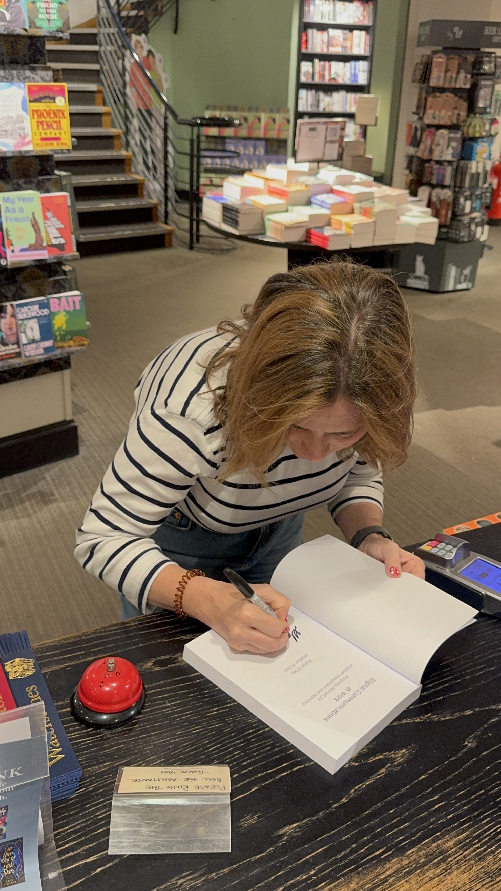
Bristol again, this time for Forwards. There is still nothing better than a weekend in a field with loud music and good friends, and at 46 I think we can safely conclude I’m not going to grow out of it.

The weather did its level best. Once you’ve accepted that you look like a drowned rat and there is no longer anything worth protecting, dancing in the rain turns out to be enormous fun.

Little Simz, Wet Leg, Self Esteem and Viagra Boys all delivered. Tricky did not: weirdly quiet, strange atmosphere, and the peculiar experience of being able to hear his backing singers perfectly while the man whose name was on the poster remained largely theoretical. Princess Nokia was simply bad.

And a Rubicon crossed. For the first time in my life, I had genuinely never heard of one of the festival headliners.

I assume this is how it begins. Next year I’ll be bringing a folding chair.

Consuming

All Dolly, all week, after the news broke on Wednesday. Veering chaotically between bluegrass, the classics and Backwoods Barbie, all bought during a lengthy Dolly phase that followed a trip to Tennessee and a pilgrimage to Dollywood.

Live your life such that when you die the praise is that unanimous.

Me at Dolly’s Tennessee Mountain Home, a million years ago

Coverage

I wrote a piece for Reworked about the Spirit Airlines data sale, which is now the subject of a bidding war involving Google and a startup that builds AI agents to work inside simulated companies. A sentence that would have required considerably more explanation five years ago.

The argument, roughly: we spent a decade telling people to work out loud, on the understanding that persistence would work in their favour. Write things down. Share what you know. Leave a trail somebody else can follow.

What Spirit demonstrates is that the archive can outlive the conversation, the project, the team, your employment and, eventually, the company itself. And the first thing people stop writing down once they’ve noticed that isn’t the decision. It’s the messy reasoning behind it — the disagreement, uncertainty, context and half-formed thinking — which is the only part that was ever genuinely inheritable.

There’s a second half I expected to find harder to write than I did, about why that archive is worth twelve and a half million dollars.

Workplace software gets built by small young companies where twelve people talk to each other constantly, then sold to organisations with shift patterns, works councils, contractors, subsidiaries, six layers of sign-off and thirty years of documents nobody can find. The people building software for large organisations have surprisingly little evidence of what life inside one actually looks like.

Spirit’s archive isn’t a use case. It’s a world.

Which is why the sale is simultaneously creepy and entirely economically rational. Both things can be true at once, which is what makes it an argument rather than a lament.

The whole thing started as a paragraph in a weeknote a fortnight ago. I cut it because it was too much for the space it had. Turns out it was an essay.

Published

I’ve started putting essays on the site as well as these weeknotes. Weeknotes are chaotic by design – whatever happened that week, from day rates to a Dolly Parton deep dive. Some things need more room than that, and one subject at a time.

The first few are up:

Travel

This weeknote comes to you from a characterless, overpriced pub in Bristol Airport, which scores precisely nothing under the LoungeWanker rules.

Home for forty-eight hours, then back to the UK for client meetings.

The glamour of international consultancy remains largely theoretical.

This week in photos

Start with Discovery: how to find out what’s actually wrong with your internal comms

A surrealist painting of a bowler-hatted man examining an open refrigerator with a magnifying glass. The brightly lit fridge contains nothing but a grey four-drawer filing cabinet. The sparse, muted room and the man’s solemn attention make the absurd scene feel entirely ordinary.

“We need a new intranet.”

I get this brief a lot. Sometimes it’s an app. Sometimes it’s “we need to reduce email volume” or “we need to do something about Teams.” Occasionally someone has already got as far as choosing the product and would now like some research to confirm they were right.

Unfortunately none of these things is actually a problem. They’re solutions somebody has already chosen, usually in a meeting I wasn’t in, and my job as briefed is to go away and build the thing.

Jon and I spent an hour with IABC members this afternoon making the case for not doing that. The session was billed as how to find out what’s actually wrong with your comms, which is a better title than we’d have come up with ourselves because it names the gap rather neatly. Most organisations know something isn’t working. Far fewer can tell you what. And the distance between those two states is Discovery.

The audit trap

When comms teams do decide to look before they leap, they nearly always reach for an audit. Catalogue the channels. Count the newsletters. Map the publishing calendar. Produce a spreadsheet with 400 rows in it and a slide saying WE HAVE 17 CHANNELS, as if the number itself is the diagnosis.

Audits aren’t useless. They’re just usually the wrong place to start. For one thing, an audit tells you what you’re serving, not what anyone wants to eat. It’s a stocktake of the fridge. You come away knowing you own a lot of yoghurt and no bread, but not whether anyone in the house is lactose intolerant.

Everything you learn is bounded by what already exists. Which means the thing that might actually help — the channel you don’t have, the moment in somebody’s day you’ve never designed for, the workaround everyone uses instead — is structurally invisible.

The second problem is slightly more awkward. If your team publishes the channels, your team is now auditing its own homework. You will discover that the newsletter is broadly fine and the intranet could do with a redesign, because those are conclusions everyone can live with. I’ve watched very capable people do this in complete good faith. It isn’t dishonesty; you just can’t see the water you’re swimming in.

Discovery starts at the other end. Not “what have we got?” but “what are people actually trying to do, and where does it go wrong?

What Discovery actually is

The idea isn’t ours, and it isn’t new. It grew out of agile and user-centred design, after enough expensive digital projects had failed for people to notice a recurring feature: teams kept leaping enthusiastically towards solutions before they’d properly understood the problem. The UK Government Digital Service made Discovery standard practice, and the discipline has gradually seeped into adjacent fields ever since.

Internal comms has been slower to catch on, partly because we’ve never really thought of ourselves as builders of things. But we are. A channel is a product. Content is a service. And the failure modes are remarkably similar: eighteen months, a six-figure budget, a great deal of stakeholder excitement, then launch day arrives and everybody else carries on with their lives.

At its simplest, Discovery means swapping assumptions for evidence. It’s the shift from “what do we want to say?” to “what do people need, and what would have to be true for this to work for them?” That is more mindset than methodology, and it can be uncomfortable because it asks you to slow down at precisely the point everyone is desperate to demonstrate momentum.

One leader I worked with used to say “facts are friendly”, usually just before somebody put an extremely unfriendly number on a slide. It’s the right instinct. The point of Discovery isn’t to prove your gut right. It’s to find out, early and cheaply, which bits of your gut are wrong.

Why slowing down makes you faster

This is the bit that gets pushback, because Discovery looks like delay. Four to six weeks of research before anyone builds anything appears on a Gantt chart as four to six weeks in which nobody has changed the colour of the homepage and everyone’s still complaining about it. When budgets are tight and a sponsor wants a launch date, it’s therefore one of the first things to disappear.

But the cost of being wrong rises sharply the later you find out. Fixing a misconception on a whiteboard costs an afternoon. Fixing it during build costs a change request. Fixing it after launch costs the change request, the migration, the rework and some portion of the credibility you’ve just spent telling everyone the shiny new thing was going to make their working lives better.

Software engineering learned this decades ago, largely by making all these mistakes first. There are various neat rules of thumb suggesting defects become ten times more expensive at each stage. I’d treat the exact multiplier with suspicion; the underlying point is less controversial. Finding out early is cheaper than finding out late.

But there’s another failure mode that matters more than money. Look at why large internal projects go wrong and it’s rarely because somebody couldn’t make the technology function. It’s unclear requirements, unexamined assumptions, teams building competently and diligently towards a destination nobody properly agreed. You cannot engineer your way out of having solved the wrong problem, and no amount of change management will persuade people to adopt something that simply doesn’t fit their day.

Discovery is cheap insurance against building the wrong thing beautifully.

Start with what you already know

The first move isn’t research. It’s an inventory of belief.

Most organisations are sitting on years of potentially useful material: old comms surveys, engagement data, post-implementation reviews, research from the last intranet project, a strategy deck from three restructures ago. Some of it is gold. Some of it is actively misleading. Old research is like milk: check the date and give it a sniff before pouring it over anything important. A survey run before a major restructure tells you a great deal about an organisation that no longer exists.

Then write down what you think you know. Not vague impressions, but specific claims that can turn out to be wrong:

  • Frontline workers don’t see HR updates because they don’t have email access.
  • People ignore the intranet homepage because it’s cluttered and irrelevant.
  • Managers are quietly rewriting key messages before they reach their teams.

Put them on a board with four columns: to test, partially validated, validated, disproven. Then move them as the evidence arrives. Trello, Planner, Notion, spreadsheet, sticky notes: it really doesn’t matter. What matters is committing your assumptions to writing before you start looking for evidence, so you can’t quietly retrofit the story later. Academics call this pre-registering your hypothesis. In comms, I prefer to think of it as making it harder to mark your own homework twice.

It does something else useful too: it stops Discovery sprawling. You’re not setting out to research absolutely everything anyone has ever thought about internal communication. You’re pulling on named threads. And when a stakeholder asks why you’re recommending something, you can show them the belief, the evidence and how your view changed, which is a significantly better answer than “trust me, I did some interviews.”

Means, motive and opportunity

The most useful frame I know for understanding user needs is borrowed from every moderately competent television detective.

Means: can people technically access the channel? Login, device, email address, permissions. This is where comms teams tend to stop, because it’s the bit we can see and the bit IT can report. But access is table stakes. It tells you what’s technically possible, not what anybody actually does.

Opportunity: when, in the real shape of someone’s working day, can they engage? Five quiet minutes at a desk? Thirty seconds on a phone between jobs? Nothing until they’ve clocked off and would rather be literally anywhere else?

And then motive: why would they bother? Does this help them do the job faster, better or with fewer headaches? If not, attention evaporates regardless of how lovingly somebody has written the CEO update.

We worked with an organisation employing hundreds of maintenance staff who spent their days out on the road. Adoption of the intranet was dismal. Leadership’s diagnosis was that the site needed to work better on tablets. On paper, means looked fine: everyone had a login.

Then we went and watched people work. There was one device per vehicle, not per person, so access meant sharing a tablet behind a clunky login. Opportunity was worse. They spent most of the working day driving, and unsurprisingly were not allowed to use a device at the wheel. Their main window for checking the intranet was therefore at the end of a shift, parked up, when its principal competitor for their attention was going home. And then motive: why wrestle with a slow site to read generic organisational news that had nothing whatsoever to do with the job in front of you?

A tablet-optimised intranet would have solved almost none of this. What helped was removing friction, designing properly for mobile and introducing audio content people could listen to hands-free while driving. None of that is especially clever. It is, in retrospect, painfully obvious — but things often become obvious once you’ve bothered to look.

Mix your methods, and skip the focus groups

Surveys and analytics tell you what is happening and, roughly, at what scale. Interviews, observation and diary studies help tell you why. Treating these as competing methodological tribes is a category error: you need both.

Analytics have one particularly important blind spot in internal comms: they can only show you the behaviour of people who are already using your channels. The employee who gave up six months ago leaves no trace. Neither does the colleague who never had access in the first place, nor the team who have quietly moved their entire working life into a WhatsApp group you know nothing about.

Those shadow channels are often the most revealing thing Discovery surfaces. They show you precisely what the official system is failing to do, because somebody has already gone to the trouble of building a workaround.

One method I’d generally avoid for diagnosis is the focus group. They’re seductive: one meeting, lots of voices, apparently faster than doing a load of individual interviews, and senior leaders love them. In practice, people are much less likely to admit in front of colleagues that they don’t understand something, dislike something or have abandoned the official process altogether. Add hierarchy to the room and it gets worse.

To run one properly you need two researchers anyway, which rather eats into the supposed efficiency. You also have to find a point when eight busy people are free at once, so good luck with that. Focus groups are useful for co-creation and testing ideas. They’re a fairly poor way to diagnose what’s actually going wrong.

Knowing when to stop

Research is not an endurance sport. When the same hypotheses keep getting reconfirmed and new interviews stop surprising you, you’ve hit saturation. Stop. More research at that point won’t make you more certain; it will mostly consume money you could be spending fixing the thing you now understand.

For most comms Discoveries, a part-time project over roughly eight weeks is a reasonable rule of thumb. Larger and more complicated organisations may need longer. Genuinely unexplored territory may need longer.

Then you synthesise: cluster the findings, name the themes, show the patterns and be explicit about what your evidence cannot tell you. Every research method has biases and gaps. The mistake isn’t using imperfect evidence — there is no other kind — but presenting it as complete.

And finally, triage. What’s a quick win? What’s structural? What needs a year? What would require an entirely different operating model? And, crucially, what isn’t yours to fix?

A good Discovery will surface things that look like communication problems but aren’t: a broken process, an unpopular policy, a manager who doesn’t manage, a workload problem, a system designed around a neat version of the organisation that has never existed outside PowerPoint. Being able to tell a leadership team “this is not a communication problem, and no new channel will fix it” is one of the more useful outputs of Discovery, even when it isn’t what they hired you to say.

Do this properly and you arrive at the business case with something surprisingly rare: a clear account of what is actually wrong, evidence that it is wrong, and a defensible view about what to tackle first.

Which seems a considerably better place to start than “we need a new intranet.”

Discovery is Chapter 1 of Digital Communications at Work, the book I wrote with Jonathan Phillips. It covers all eight steps in full, including stakeholder interviews, ethics and synthesis. The research methods toolkit that wouldn’t fit in the chapter is free to download. And if you’d rather not run one on your own, that’s what we do.

Designing channels for complex organisations

A quiet surrealist office in muted grey tones. A woman in a grey suit stands with her back to us, facing five identical open doors. Each doorway reveals a different sky: blue and sunny, dark and stormy, warm evening light, pouring rain, and bright clouds. A sparse wooden desk and lamp sit to one side as she stands motionless, choosing none of the doors.

Somewhere in your organisation there is a person wearing one organisation’s uniform, carrying a second organisation’s lanyard, and logging into a third organisation’s systems with a password only the first can reset.

They are doing a job that at least two of those organisations believe belongs to somebody else.

They are not an edge case. Not any more.

Research by SAP and Oxford Economics, surveying 2,050 executives across more than 20 countries, found that only 58% of workforce spend goes on employees. The other 42% buys contingent workers and service providers: contractors, agencies, IT outsourcers, consultancies. More than half of those executives said their organisation couldn’t conduct business as usual without them.

And yet we still draw the organisation as a pyramid.

One person at the top, everyone else arranged obediently underneath, solid lines and dotted lines and a surprising amount of money spent arguing about where they should go. Then we design internal communications for that picture: one intranet, one all-staff email, one audience, one direction of travel.

The picture was always a simplification. What’s changed is how much of the actual organisation now sits outside it.

The organisation on the slide isn’t the organisation people work in

Real organisations are messy.

Work runs through partners, contractors, shared services, joint ventures and outsourced back offices. Two organisations can share a finance function and approximately none of a culture. A team is fully shared across two employers while HR is shared only transactionally. Someone is employed by one entity, works exclusively for another, and consequently can’t see either one’s internal communications properly.

This isn’t unusual, and it isn’t a temporary state of disrepair on the way to something tidier. It is the organisation.

In Digital Communications at Work, Jonathan Phillips and I describe today’s internal audience as including contractors, freelancers, agency staff, suppliers and partners: people who sit inside the working life of an organisation without sitting on its payroll.

The boundary around “internal” has got very fuzzy indeed.

Then add all the people your internal communication channels were never particularly good at reaching in the first place. Frontline and deskless colleagues make up around 80% of the global workforce, and many have no corporate email address and no reason to spend their working day lovingly browsing the intranet.

Access is uneven. Context is uneven. Someone who has worked there for fifteen years has a completely different map of the place in their head from someone who has worked fifteen shifts.

Enterprise software doesn’t much like any of this, because enterprise software has generally been designed for an organisation tidier than any organisation that has ever existed. Even now, major platforms struggle with someone holding multiple affiliations inside a single institution, never mind across several (working across two or more instances of Teams, for example, remains a PITA).

So we design channels for the diagram and then wonder why the people who don’t fit neatly inside the diagram aren’t using them.

This is an internal communications problem before it’s a technology one

When the channel estate isn’t working, the instinct is usually to go shopping.

New intranet. Better search. Employee app. AI assistant. Something with a reassuringly expensive implementation partner attached.

But a systematic review of 77 studies of digital internal communication found the same problem recurring: channels rolled out top-down without enough attention to whether they fitted how people actually worked.

The tool was rarely the interesting bit. The assumptions underneath it were.

And the bar for changing people’s behaviour is high. Gourville’s rule of thumb suggests people need to perceive a new system as roughly nine times better than the habit it replaces before they’ll switch.

Against an existing workaround — a WhatsApp group, a noticeboard, asking Sandra in Finance because Sandra actually knows — nine times better is a demanding standard.

Against nothing at all, the bar is practically on the floor.

Which is worth remembering before spending a year replacing something that works reasonably well for the people at the centre while leaving the people at the edges with bugger all.

Complexity doesn’t make channel design impossible. But it makes guessing impossible.

Start with what communication needs to do, not which platforms you own

The trouble with mapping your internal communications channels as a list of tools is that it tells you what you’ve bought.

It doesn’t tell you whether any of it works.

You get an inventory when what you need is a diagnosis.

The five-layer model we use in the book maps the capabilities a communication ecosystem needs rather than the products that happen to deliver them:

  • Plan: where campaigns, priorities and editorial calendars get coordinated. Invisible to employees; essential to communicators.
  • Collaborate: where content gets drafted, reviewed and signed off.
  • Publish: the source of truth. Structured, accurate and searchable.
  • Distribute: getting the right thing to the right person at the right time.
  • Discuss: dialogue, feedback and sense-making.

These aren’t five little boxes into which you must now dutifully sort Microsoft 365. They overlap. They reinforce one another. A single announcement might pass through all five.

The useful thing about thinking in layers is that the layers survive the platform churn.

Tools come and go. Names change. Products get bundled, rebranded, sunsetted and occasionally transformed into an AI assistant nobody remembers asking for. But these five jobs still need doing somewhere.

And in a complex organisation, the model lets you ask a much more useful question than should we have one intranet or several?

You can ask: what actually needs to be shared?

Shared or local? It depends what you’re sharing

Every complex organisation eventually has this argument.

Central control gives you accuracy and consistency, but can feel distant and generic. Local ownership gives you nuance, relevance and speed, but also duplication, contradiction and the occasional page last updated during the Cameron administration.

Choose entirely one or the other and you lose something you need.

At the level of “should we have one intranet or two?”, this is almost impossible to resolve because it isn’t really a technology question. It’s a question about identity, brand, budget, power and who gets to decide things, wearing a SharePoint hat.

Break it into layers and it gets much easier.

I ran this exercise recently with communications, HR, digital and transformation leaders across two organisations that shared much of a back office and very little else. The resulting pattern is one I’d expect to see in a lot of complex organisations.

Publish pulls hard towards shared.

Policy, terms, anything with legal or regulatory weight: you want one authoritative version. Copying the same information across multiple estates is how you end up with two confidently contradictory answers to the same question.

This is the layer I’d consolidate first.

AI has made this more important, not less. When an assistant starts surfacing intranet content directly, stale and duplicated pages don’t merely sit quietly being wrong somewhere nobody visits. The machine can now fetch them and be wrong on your behalf.

Discuss stays stubbornly local.

This is where culture lives. You can establish minimum standards for conduct and moderation, but you can’t centrally procure a community.

People have an irritating tendency to decide for themselves who they want to talk to.

Design this with them, not for them.

Plan sits awkwardly in the middle, because of course it does. Different leadership cycles, priorities and approval chains make fully shared planning difficult even where everyone is notionally committed to it.

Collaborate follows the work. Different brands, different style guides, different approval processes. Making all of that shared generally requires senior decisions considerably bigger than “where shall we put the Word document?”

And then there’s distribution.

Your distribution problem is really a people-data problem

Distribution is the layer that catches people out because its unit isn’t an organisation.

It’s a person.

A particular person, with a particular contract, role, location, device and set of permissions, who may work for two organisations and be properly represented in the directory of neither.

Which means distribution becomes an identity and employee-data problem long before it becomes an internal communications channel problem.

If you can’t reliably answer who is this person, what should they be able to see, and how can we reach them?, then targeting is mostly decorative.

You can spend weeks designing beautiful audience segments. If the finance officer employed by Organisation A but working full-time for Organisation B isn’t correctly represented in the underlying systems, no amount of clever channel strategy will make them magically appear on the right list.

Get identity right and all sorts of things become possible: one publishing estate with personalised views, targeted distribution that actually reaches contractors and frontline staff, and clear rules about who gets access to what.

Get it wrong and you can rebuild the intranet every three years until retirement and remain faintly disappointed by the results.

The bit of the digital workplace nobody sells you

There is a part of all this no vendor will quote for: Identity. Navigation. Search. A shared design language. The connective tissue that makes a collection of separately procured tools feel, to the unfortunate person trying to use them, like one place.

You can buy an ITSM platform, an HR system, a CMS and an employee app. You can give each of them a cheerful name and launch them with cupcakes.

But you can’t buy coherence.

The average organisation now runs well over a hundred applications, each perfectly sensible on its own terms and together producing an experience like an orchestra warming up: every instrument playing its own tune, quite competently.

In the book we describe the intranet as the wrapper, not the chocolate bar. I’d go further: the important bit isn’t any single platform. It’s the experience created at the joins.

Somebody has to own that.

Not each tool. The whole.

Because choices made in isolation get paid for at the joins, and the joins are where employees actually live.

Design an internal communications ecosystem that survives the next reorganisation

Complex organisations reorganise. It’s practically a hobby.

Shared services get created, merged, renamed and unpicked. Partners arrive and leave. Business units combine. Someone unveils a new operating model with pleasingly rounded rectangles and announces that it will make everything simpler.

If your internal communications architecture depends on the current organisation chart remaining true, start the countdown.

There are five principles I’d design around instead:

  • Adaptability: assume the organisation chart will change and the channels shouldn’t have to
  • Accessibility: including the version that means frontline, deskless and low-bandwidth access, not just WCAG compliance
  • Clarity of ownership: “who looks after this?” should be a question with an answer
  • Interoperability: content and state need to be able to leave the system they were created in.
  • Cognitive simplicity: every additional interface is a tax, and employees pay it

And I’d add a sixth, less comfortable one: mandate.

Skills you can hire. Time you can, eventually, carve out. But someone needs the authority to make decisions across the boundaries.

In a shared or complex organisation, the person responsible for the digital workplace without the authority to say no to senior stakeholders on either side owns the blame and none of the levers.

No amount of elegant architecture makes organisational politics disappear. But being explicit about who has the mandate to make decisions is usually the difference between a channel strategy that survives contact with reality and one that gets quietly negotiated into beige.

Design for the organisation you actually have

The useful shift is a small one.

Stop treating organisational complexity as a defect to be tidied away before the real design work starts. Treat it as the design constraint.

Because the mess isn’t evidence that there’s no system.

Quite often, the mess is the system.

It’s running on local knowledge, friendships, workarounds, favours, WhatsApp groups and hundreds of tiny negotiations nobody has ever written down. It’s the person everybody knows to ask. The spreadsheet somebody maintains because the official system doesn’t quite work. The contractor who’s been there eight years and still can’t open the link in the all-staff email.

Designing a beautifully logical channel architecture that ignores all of that doesn’t simplify the organisation.

It simply gives people one more thing to work around.

Nobody experiences a tool. They experience a task.

Design for the task, and for the person trying to get it done — whichever organisation’s lanyard they happen to be wearing today.

This essay draws on ideas from my book, Digital Communications at Work: Designing channels for employee engagement and experience, written with Jonathan Phillips and published by Kogan Page.

If you’re wrestling with this in your own organisation, my consultancy practice, Lithos Partners, runs discovery, designs channels and develops digital workplace strategy for organisations that don’t fit the neat diagram.

Weeknote 2026/34

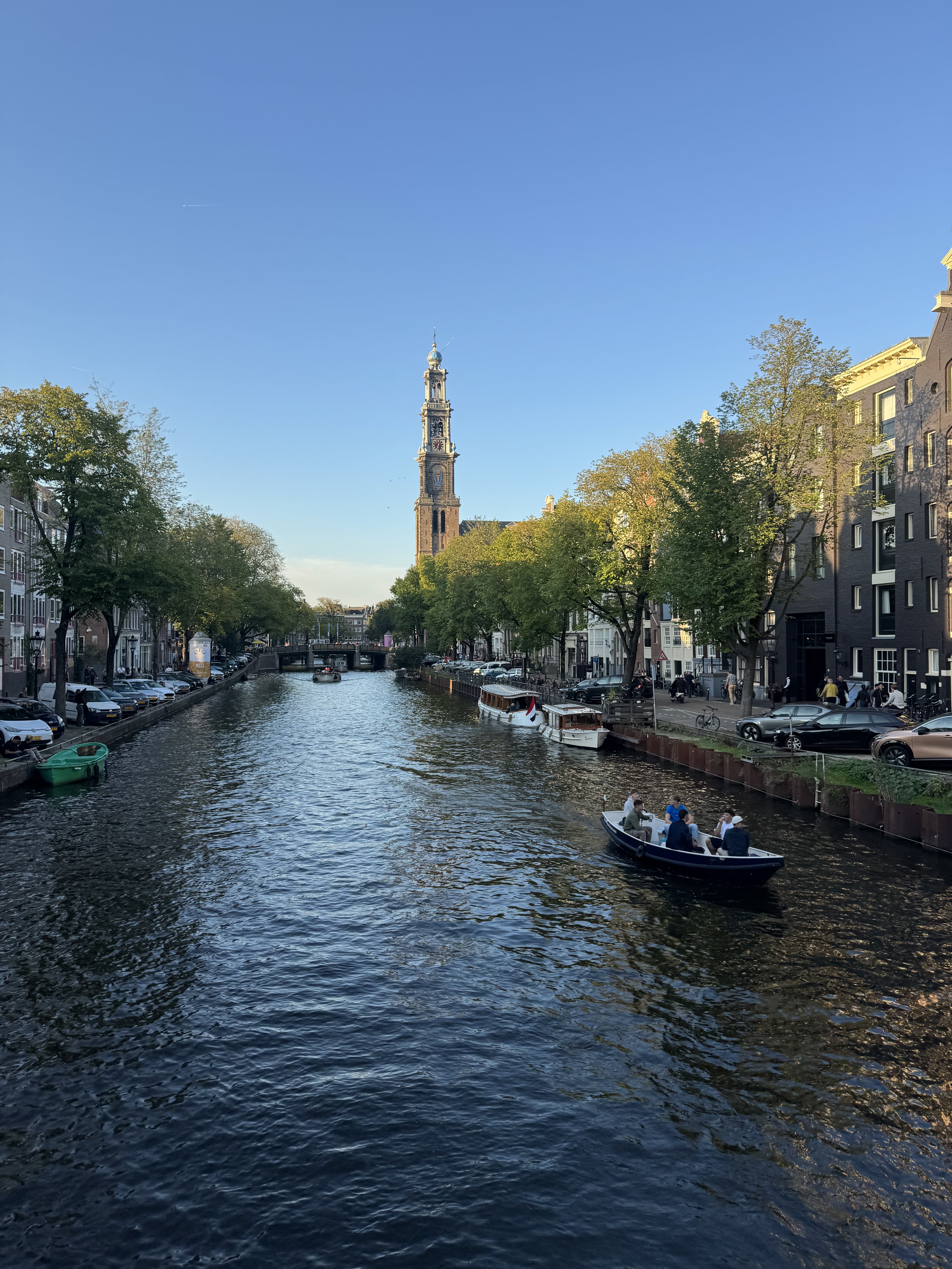
An Amsterdam canal at night, lined with lit gabled houses and a moored houseboat with flower boxes. A small open boat full of people passes under a bridge, its wake catching the reflected lamplight.
Prinsengracht after the concert (Photo: me)

My second favourite part of the Prinsengracht Concert, after several thousand people singing Aan de Amsterdamse Grachten together, is what happens immediately afterwards.

Hundreds of boats have spent the evening crammed into the canal, several deep, wedged against one another in a configuration that suggests nobody gave much thought to the concept of leaving. Then the concert ends and, simultaneously, everyone would like to go home.

It is magnificent.

For the next half hour the Prinsengracht becomes a giant aquatic game of Dodgems. Boats reverse into gaps that don’t exist. People push off neighbouring vessels with their hands. Someone three boats away is shouting instructions to a person they have never met. Entire flotillas shuffle sideways because one tiny boat has committed to a three-point turn and apparently we’re all seeing this through now.

From the bridge, it looks like complete chaos. Except it works.

There’s a system in there. It’s just not the sort anyone would put into PowerPoint. It runs on eye contact, shouted instructions, local knowledge, mild peril and hundreds of tiny negotiations between people adjusting constantly to what everyone around them is doing. There are formal rules, obviously, but they get you only so far when you’re pointing backwards in a canal with someone’s bow six inches from your wine glass.

Organisations work rather more like the Prinsengracht at 11pm than anybody designing an operating model would ideally like to admit.

We draw the hierarchy as a pyramid, put one person reassuringly at the top, arrange everyone else underneath and call it an organisation. We map systems into boxes. We assign owners. We draw solid lines and dotted lines and spend quite a lot of money arguing about where they should go.

This is all useful, up to a point. The problem comes when we mistake the diagram for the thing it describes. Reality has an irritating habit of continuing to be three-dimensional after we’ve put it on a slide.

The mess isn’t necessarily evidence that there is no system. Sometimes the mess is the system.

This week at work

Organisations are way more complicated than their org charts.

Someone can turn up wearing one organisation’s uniform, carrying another’s lanyard, logging into a third’s systems with a password reset only the first can authorise, doing a job that half of them think belongs to somebody else.

Work runs through partners, contractors, shared services and joint ventures, and plenty of people hold more than one allegiance at once. There’s a chapter on this in the book, framed mostly around the gig economy and deskless work, but the same problem turns up anywhere separate organisations share most of a back office and almost none of a culture.

That’s a comms problem before it’s a technology one. Your channels have to fit the organisation you actually have, mess included, rather than the neat little pyramid with one person at the top and everyone else arranged obediently underneath.

This week I ran a workshop with comms and digital leaders in an organisation dealing with exactly this kind of complexity. We started with what a digital workplace actually is, and why it matters more, not less, when the organisation around it is changing.

It’s how change gets communicated, obviously. But it’s also how you unlock the value you were promised when you bought all those services in the first place. A service nobody can find is, for most practical purposes, a service you don’t have.

I introduced our graphic equaliser model: the idea that a digital workplace is a mixing desk with four faders — comms, knowledge, transactions, and community and collaboration — and every organisation runs a different mix. Some crank comms all the way up. Others lean heavily into tools and self-service. We spent time looking at where their balance sits now, and where it needs to move.

I love sessions like this because I learn as much as I share about the increasingly messy reality of how work gets done. I always say there’s no right balance, only what’s right for your organisation. What this one reminded me is that there isn’t necessarily one setting for an organisation either.

Different parts of the business need the dials in different places. Increasingly, so do individuals.

Which means the digital workplace has to flex around the organisation you actually have. That took us into the perennial question of what needs local control and what benefits from central planning.

It’s harder when there are multiple reporting lines, because budgets and approvals follow accountability, while work has the irritating habit of ignoring it. Publishing pulls hard towards shared: one system, different lenses. Discussion stays stubbornly local, because that’s where culture lives and nobody particularly wants theirs decided by committee. Planning sits awkwardly in the middle, because of course it does.

No amount of elegant architecture fixes the fact that organisations contain politics.

The dials get set by whoever holds the budget line. They get lived with by everyone else.

Also this week

I tore a hamstring in a HIIT class, which is what I get for going to HIIT classes.

It turned out to be relatively minor, but kept me out of the gym and mostly confined to the flat for the week. Last weekend I was hobbling around with a walking stick, mentally rearranging the next three months of my life around my exciting new identity as Person With Hamstring Injury. By Friday I was walking again, albeit not at my usual faintly aggressive pace.

Recovery was swift enough that I’ve decided to take personal credit for it, having contributed absolutely nothing beyond sitting still.

The one casualty was the line dancing class I’d signed up for as part of my ongoing efforts to Try New Things. I was fully prepared to attend and be heroically bad at it. Then I couldn’t go, so my potential as a line dancer remains mercifully untested.

Next time.

Saturday was the Prinsengracht Concert, one of those moments every year that makes me absurdly glad to live here. The city is both backdrop and main character: a stage built over the canal, thousands of people lining the water, boats packed in until the whole thing looks faintly impossible.

It ends, as it always does, with everyone singing Aan de Amsterdamse Grachten together — a song about how beautiful this city is and how nobody could wish for anything better than to be an Amsterdammer.

Can confirm.

Consuming

Saw Sparks in Nijmegen, for their only Dutch date this year, in a lovely outdoor theatre. We’d got ourselves in the mood the night before with The Sparks Brothers, Edgar Wright’s documentary: two and a quarter hours of people you already suspected of having excellent taste confirming that they do.

The gig was delightful right up until it wasn’t. They finished This Town Ain’t Big Enough for Both of Us and the heavens opened. They made it through Whippings and Apologies with rain sheeting off the canopies before the show was finally called off for safety.

Sixty years, twenty-odd albums, and I got about two thirds of a set. The Mael brothers have outlasted glam, disco, synth-pop, Britpop and several physical media formats, only to be defeated on Thursday night by Dutch weather.

I’ve also been transfixed by the Spirit Airlines story all week. Google has bought the bankrupt airline’s entire internal archive for $10 million: a hundred million emails, five hundred million Teams messages, seventeen million files, all to train AI on. Former employees are now in court trying to get themselves removed from the dataset.

It has absolutely everything.

What happens to how people behave at work once they realise the archive might outlive the company. The legal question of whether anything you wrote at your desk was ever really yours. Bankruptcy law colliding with data protection colliding with AI. Organisational complexity. Workplace technology. The lot.

And then there’s the bit I keep turning over, because I love nothing more than to be a contrarian, which is that this might actually make the software better.

Enterprise software has always been designed for an organisation tidier than any organisation that has ever existed. When I spoke to the Facebook team during the Workplace years, they seemed genuinely baffled that companies didn’t want information to be open in the way it was at Facebook. That openness was the product. It was also one of the reasons so many corporates couldn’t use it.

Microsoft, all these years later, still can’t cleanly accommodate someone holding multiple affiliations with one institution, never mind several institutions at once — which describes an enormous number of people I encounter through work.

Nobody has ever had a really good dataset showing how a large organisation actually functions, because all the interesting stuff is behind a firewall. The formal structure is easy. The useful bit is the messages, workarounds, accidental networks, weird permissions, duplicated effort, informal power and the seventeen people you have to ask before discovering that Sandra in Finance knows how it works.

Now, suddenly, there’s one on the open market.

The messiness is exactly what makes it valuable.

Which is also the problem. The upside depends on the data being rich, specific and human enough to reveal how work really happens. The privacy disaster is that it’s far too rich, specific and human to anonymise properly.

There’s no version where you get one without the other.

Connecting

Three this week, all people passing through.

Mark Chapman, who runs an NHS intranet, was briefly in town. I failed to have a proper conversation with him at the book launch, just as I failed to have a proper conversation with almost everyone at the book launch, so we made up for it in my local by nerding out about intranets at considerable length.

Then Chris Higham, finally, in person. Chris and I are part of a group that formed on Twitter years ago around sharing our fitness ups and downs, then migrated to WhatsApp when the platform went the way it went. It’s still one of the most supportive gangs I’m in: the rare group chat that survived the collapse of its natural habitat (I wrote about that community in 2025/49)

He was over with his family on holiday, so I got to meet all of them too.

And yesterday, a walk-and-talk with Anne Ditmeyer, a Paris-based designer and facilitator I met at the Awesome Authors meet in London in May (see Weeknote 2026/21). She was in the Netherlands for a design event, so we walked and talked about unlocking creativity. Eexactly the sort of conversation that gets better once you remove the table.

She also introduced me to Bonnie Cauble and Sarah Pedlow, both creatives based here. Amsterdam continues its long-running campaign to make everyone in the world no more than two introductions away

Travel

Autumn has been sitting ominously in the calendar for a while now.

This week it begins: a quick trip to Bristol.

This week in photos

SharePoint is a box of Lego: how to choose an intranet platform

A muted, Magritte-style painting of a woman in a grey suit seen from behind, sitting at a wooden desk building a large grey Lego Star Destroyer. Loose bricks and a sorting tray are spread across the desk, with an open instruction booklet in front of her showing a different model. A brass lamp, a window onto a pale sky, and a framed painting of clouds fill the quiet grey room.

Every now and then, someone asks me what the best intranet platform is.

It’s a reasonable question. It also has no answer, which makes it an annoying one to be asked at a party. (I’m fun at parties, honestly).

There are dozens of dedicated intranet products before you get anywhere near the various flavours of SharePoint and the growing pile of employee apps. Then come the demos. The analyst reports. The comparison matrices with forty rows and an encouraging quantity of green ticks. The sales teams who each explain that their product was designed specifically for organisations exactly like yours.

Somewhere around week three, IT joins the conversation with a list of things they will never support, procurement asks a question nobody can answer, somebody discovers a security requirement that apparently existed all along, and everyone quietly forgets what problem they were trying to solve.

Which is why the first job isn’t evaluating intranet platforms. It’s deciding how you’re going to evaluate them.

Why it’s usually SharePoint

For most large organisations, SharePoint is the default before anyone has made a decision at all.

It’s bundled with Microsoft 365. IT already knows how to run it. It handles documents and permissions properly. It connects to Teams, OneDrive and Outlook without requiring an integration project, three consultants and a small blood sacrifice.

And there’s a practical reason that gets less airtime: it’s considerably easier to get approval to build something on a platform you already own than to ask for money for a new one.

Plenty of SharePoint intranets exist not because anyone chose SharePoint, but because choosing anything else required a fight nobody had the appetite for.

That’s not necessarily a bad thing. You can build genuinely excellent intranets in SharePoint. Most years, eight of the top ten in the Nielsen Norman Group Intranet Design Annual are built on it.

But in a world where everyone wants a fully formed toy, SharePoint is a box of Lego.

And as with Lego, what you end up with depends less on how many bricks you have than on your skills, imagination, time and budget.

Allow me to stretch this analogy well past the point of good taste.

Route one: the box of Lego

a pile of lego bricks in various colours

Native SharePoint, straight out of the box, is an effectively unlimited supply of bricks.

In theory, you can build anything. A castle. A cathedral. A working model of the Endurance.

In practice, you have a job, four other priorities and a stakeholder who wants their department’s page to be a different shade of blue.

So you build a small house with a door and two windows.

And that’s fine! It meets the brief. Everyone can get inside. It shuts people up for five minutes.

It just isn’t quite the magnificent thing everyone imagined when they heard the word flexible.

Because that’s the catch with infinite flexibility: every decision is now yours to make. And defend. And document. And remake when somebody sufficiently senior sees it for the first time six months after approving it.

You can build a spaceship.

You will spend six months arguing about where to put the rockets.

Route two: the Lego kit

A Lego main street kit, built with shops and lego figurines

Buy a Lego kit and you follow the instructions and get something genuinely impressive in an afternoon.

The intranet equivalent is an intranet-in-a-box: a product that sits on top of SharePoint and makes it behave rather more like a fully fledged content management system.

You get templates. A design system. Navigation. Governance features. Better publishing tools. Quite a lot of decisions somebody else has already made for you.

We’ve delivered one of these end to end, including all the content, in three and a half months.

The trade-off is that you’re stuck with the pieces in the box.

If you want to turn the record store into a bookshop, you’re out of luck because the kit only came with the orange and yellow storefront.

For a lot of organisations, this is exactly the right answer. In fact, the constraint is often the thing you’re paying for.

Fixed templates end the debate about page layouts before it starts. Information appears in the same place on every page. Editors don’t need to become amateur web designers. Readers don’t have to relearn the interface every time they move from HR to Finance.

Constraint can be a feature.

Expect pushback from content editors who want more control. Expect someone to ask why you’re paying licence fees for a thing that sits on top of another thing you’ve already paid for.

Both are perfectly winnable arguments if you’ve decided in advance what you’re optimising for.

Route three: make your own kit

If the standard kits don’t fit, you can have one made.

An agency builds you a set of templates, components and a design system on top of native SharePoint. You get your own box of parts and your own instructions, so teams can create consistent pages quickly without designing each one from scratch.

You end up roughly where the kit gets you, except it’s your bookshop rather than someone else’s record store.

It typically takes nine to twelve months.

And when, two years later, somebody wants the bookshop to become an airport, you go back to the agency or find someone who understands how it was built.

Again: not necessarily a problem.

But it is now a thing you own.

Customisation has a habit of being discussed as a one-off cost when it’s really a small pet you’ve agreed to feed indefinitely.

Route four: build the Millennium Falcon

a complex custom scene made of lego

With enough time, deep knowledge of every component and what amounts to a 3D printer — an in-house development team — you can build almost anything.

Some of these intranets are extraordinary. Many of them win awards.

They also take, on average, twenty-three months and a team of fifteen. That number is one of the most useful things in the whole NNg Design Annual, and it’s the bit that tends to get skipped over on the way to the screenshots.

Because screenshots travel rather better than resourcing models. If you’re a team of two with a year and no development budget, an award-winning intranet built by fifteen people over two years is not a benchmark. It’s something a completely different organisation was able to afford.

There is no useful lesson in staring at their Millennium Falcon and wondering why your box contains twelve red bricks and a little plastic tree.

And the option that isn’t Lego at all

You can, of course, leave the Microsoft ecosystem entirely.

Standalone intranet platforms often have markedly better user experience, editorial workflow and mobile support. Employee apps are mobile-first and task-focused, and they’re frequently the only serious option for reaching frontline, field or contracted staff who have never logged into a corporate laptop and never will.

If your workforce is mostly deskless, this isn’t really the alternative route. It may be the obvious one.

But now you inherit different plumbing: single sign-on, people data, integrations, syncing and the possibility of content and effort quietly duplicating across two estates.

None of this tends to be the exciting bit of the demo. All of it will be the exciting bit of year two.

Before choosing an intranet platform, decide how you’ll choose

None of the above tells you what to buy. That’s because the platform was never the first question.

Four things are.

What’s the actual mix?

Every intranet is balancing the same handful of jobs: communication, knowledge, transactions and collaboration. Every organisation weights them differently.

Jon and I call this the graphic equaliser because the sliders sit in a different place everywhere.

An intranet for lawyers and engineers has a very different job from one serving retail staff on shift. A company where the intranet is primarily a route into HR services needs something different from one where its main purpose is publishing news and knowledge.

Work out where your sliders are before you look at a single product.

Otherwise the product demo will decide your requirements for you.

Who genuinely has to use it?

Not the audience in the strategy deck.

The actual people.

The contractor who doesn’t have an email address. The warehouse worker sharing a device. The colleague in the acquired company who still has the wrong identity in Active Directory. The person who visits the intranet twice a year and absolutely will not remember what you named the expenses section.

This single question rules out more platforms than almost any feature comparison.

What are the red lines?

“It has to be SharePoint because IT won’t support anything else” is a common cry and sometimes a completely real constraint.

Fine.

Find that out on day one.

There is no prize for conducting an elegant eight-week platform selection exercise and discovering at the end that three of the four options were never actually options.

Budget can be a red line. Data residency can be one. Accessibility. Authentication. Procurement. The ability to reach people without Microsoft 365 licences.

A constraint you know about is a design input.

A constraint you discover after the preferred-vendor presentation is a massive pain in the arse.

What are you signing up to run?

This is the question most platform selection processes don’t spend nearly enough time on.

Every route has an ongoing cost in people, not just licences.

Someone has to govern it. Maintain the templates. Manage permissions. Keep the navigation coherent. Support editors. Fix the search. Challenge the director who wants a button on the homepage. Notice that 40% of the content hasn’t been reviewed since 2024.

The question isn’t simply which platform is best.

It’s which one can you realistically keep good?

You’re choosing constraints as much as features

There is no universally right intranet platform.

There is a right path for your organisation: one that balances technology, time, money, capability, what your people will actually use and whatever internal red lines turn out to exist.

And every route involves a trade-off:

  • Native SharePoint gives you flexibility, but asks you to make more decisions.
  • An intranet-in-a-box makes more decisions for you, but limits what you can change.
  • A custom SharePoint build gives you control, but creates something you have to maintain.
  • A standalone platform may give you a better experience, but adds another system to the estate.

Those aren’t flaws hidden in the small print.

They are the decision.

Most organisations don’t have unlimited time or money, so they compromise on something that’s good enough for now and meets most of what they need.

That’s not a failure of ambition. That’s just pragamtism.

What matters is being able to explain why: clearly, in a sentence, to someone who wasn’t in the room.

Ideally before the first vendor demo does the explaining for you.

Because you can build a perfectly good intranet out of almost any of these.

You just can’t build one out of a decision nobody can remember making.

This essay grew out of a weeknote from December 2024 and a conversation I keep having with clients. The Lego analogy, and a fuller breakdown of the solution paths, appears in Digital Communications at Work, written with Jonathan Phillips and published by Kogan Page.

If you’re at the start of this decision, Lithos Partners does discovery, requirements and platform selection for organisations that would rather not find out in year two.

Weeknote 2026/33

A lovely spot to ponder the nature of the universe (Photo: me)

Eighty-eight per cent of the sun went behind the moon on Wednesday and it barely got dark.

That night, every star I looked at turned out to be another sun, filed down by distance to a pinprick. The moon is a rounding error next to the sun. It just happened to be closer, and in exactly the right place to block most of it.

Scale, it turns out, is extremely easy to misunderstand.

Organisations have this problem too. The bigger something gets, the more we tend to discuss it in aggregate: tens of thousands of employees, enterprise-wide adoption, transformation at scale. Eventually the people disappear altogether and you’re left moving percentages around a slide.

Over coffee this week I spent an hour talking through one person’s job. Earlier I’d been on a call about essentially the same problem across an organisation of tens of thousands. The enormous version turned out to contain exactly the same question as the tiny one: what is this person actually trying to do, and what’s getting in their way?

That’s the irritating thing about scale. To understand the big thing, you usually have to get very close to the small one.

The trouble starts when you assume it works the other way round.

This week at work

Over coffee, a friend told me her employer has been telling everyone to use AI. She’s not against it. She just doesn’t know what she’s supposed to do with it. Nobody has said what it’s for.

There is a mandate, and there is a tool, and between them a gap roughly the size of her actual job.

So I did what any normal person does to a friend on their day off and interrogated her about work for an hour.

I didn’t start by asking what she wanted AI to do. I asked what she finds difficult. What’s stopping her being as good at her job as she’d like to be?

Planning, she said.

Her industry works a long way out; she’s on Christmas 2028 at the moment, which is a boggling timescale for me, a person for whom buying food on Sunday for Wednesday constitutes advanced logistics.

The problem isn’t really making the plan. It’s holding the thing together once it exists: knowing where versions have drifted apart, where assumptions no longer match, and where six teams have all independently decided that the same fortnight would be an excellent time to do something enormous.

This is precisely the sort of work computers are annoyingly good at and human brains aren’t. So: give it the plans. Ask it to find inconsistencies, collisions and crunch points.

She said they’re so busy they tend to repeat the things they already know work. Fine. Give it the data from the last few programmes. What performed unusually well or badly? What was different? Are there patterns worth investigating?

Within about twenty minutes we’d gone from I know I’m supposed to use AI but I don’t know what for to a list of things she was genuinely excited to try.

No use-case library. No maturity assessment. No 73-slide deck entitled Unlocking the AI-Powered Future of Work.

We just talked about her job.

Her own takeaway was better than mine. She’s going to ask everyone on her team to bring one thing they’ve used AI for lately that actually made the work better or easier.

Not a strategy. Not a policy. Not a prompt library containing 400 examples nobody will ever read. Just one thing that worked, said out loud, by someone you know and trust, and not some twat from a consultancy who wears a hat indoors.

The funny part is that I’d started the week having essentially the same conversation, only with several more zeroes attached.

I’d been on a call with someone running an AI programme somewhere very large indeed, ahead of a client conversation about what adoption looks like at that scale. And scale changes the conversation surprisingly quickly. One person has a planning problem. Ten thousand people have an adoption strategy.

At organisational scale, everything acquires nouns: Adoption. Enablement. Transformation. Capability. Use cases. You can spend months discussing all of them without getting anywhere near the awkwardly specific question my friend answered over coffee:

What is hard about your job?

Same problem. More zeroes.

The technology isn’t the difficult bit. Finding the useful problem is.

You have to do that first for a person, then for a team, then somehow across tens of thousands of people. And the further you get from the actual work, the easier it becomes to replace understanding it with buying something.

Which is how you end up with an enterprise AI strategy explaining very clearly that everyone should use AI, and an employee sitting in a café saying:

Yes. For what?

Also this week

I took 24 hours off midweek and went to the coast for the eclipse.

First surprise: the Netherlands has genuinely stunning beaches. Huge sweeps of powdery sand running from the dunes straight into the North Sea. The climate makes them properly usable for approximately nine afternoons a year, which may explain why the Dutch have declined to make this a central plank of the national brand.

We got one of the nine.

Past me had also had the unusual foresight to book a cabin near the coast and buy eclipse glasses back when they weren’t €20 a pair and being traded with the intensity normally reserved for Taylor Swift tickets and Class A drugs.

We took a couple of bottles of Sol down to the beach, which I’m going to present as thematic intent rather than the consequence of the bar offering a choice between that and Heineken.

At around quarter past seven, through the cardboard glasses, the first bite of the moon appeared at the edge of the sun. Then, very slowly, it ate it.

There’s something profoundly weird about watching celestial mechanics happen in real time. You know perfectly well that the moon goes around the Earth and the Earth goes around the sun. You have presumably known this since primary school. But normally this knowledge sits in the same part of the brain as plate tectonics and the existence of Belgium: accepted as fact, rarely requiring direct confrontation.

Then you watch one enormous object physically move across another and suddenly the solar system stops being a diagram.

What I couldn’t get my head around was the arithmetic of it. The moon is enormous. The sun is so incomprehensibly much more enormous that the comparison is barely useful. And yet from one particular patch of Dutch sand, because of an absurd coincidence of distance and geometry, they looked almost the same size.

At the peak, 88 per cent of the sun was covered. It barely got dark.

That was the bit that broke my brain. You can remove nearly nine-tenths of the thing and the remaining sliver is still bright enough for the world to carry on more or less as normal. The sun, it turns out, is quite a lot of sun.

Later that night I lay in a hammock in the Kennemerland dunes waiting for the Perseids.

The advice for watching a meteor shower is blunt: no screens. Your eyes need around twenty minutes to adjust properly to the dark, and one glance at a bright phone sets you back. This isn’t mindfulness. Nobody is asking you to reconnect with your authentic self or purchase a journal. It’s optics.

So the phone went away.

I live in a well-lit city centre and almost never see stars. Properly see them, I mean. Give your eyes enough darkness and they just keep arriving. A handful becomes dozens, then hundreds, then an absolutely unreasonable number of them.

And having spent the evening staring through cardboard at our sun, I suddenly couldn’t stop thinking about what I was actually looking at.

Every one of those pinpricks is another sun.

Not a decorative light. Not a white dot conveniently provided as background scenery. An actual star: vast and violent and burning away at an incomprehensible distance, reduced by that distance to something I could cover with the tip of my finger.

Then every so often something would tear across the whole lot. A Perseid lasts perhaps a second. A streak, sometimes a flash of colour in the tail, and gone before you’ve quite finished registering it. We’d wait in the dark for another, talking quietly, then one of us would suddenly shout there at a piece of sky the other person was inevitably not looking at.

There are worse ways to spend a night.

I lay there thinking about the scale of all of it: the sun we’d watched disappear behind the moon; the other suns scattered above us; the tiny bits of comet burning up overhead; us underneath, temporarily occupying a couple of hammocks on a sand dune beside the North Sea.

The universe is offensively large.

I found this wonderful.

And then, because apparently even transcendence must eventually become professional development, I realised something mildly embarrassing about my phone.

I’ve written a book about attention and information overload. I talk about this stuff for a living. I know that phones are designed to capture attention. I know that environment beats intention. I know all the arguments.

None of that reliably stops me looking at the bloody thing.
But tell me that one glance at it will ruin my night vision and make me less able to see the meteor shower I came here specifically to see?

Phone in a drawer. For hours. No struggle whatsoever. Turns out I didn’t need better self-control. I needed an immediate and comprehensible consequence.

Design beats willpower. I really, really should know this by now.

Consuming

Two pieces by Oana Leonte, published two days apart, which have been rattling around my head ever since. The first starts with Rick Rubin, who cannot play an instrument or read music, and who told Anderson Cooper that what he’s actually paid for is confidence in his own taste. His contribution to a record is often subtraction: take that out, strip this back, do it again. He has no signature sound because a signature would compete with the judgement.

Leonte uses him to make a distinction I haven’t stopped thinking about: attention is rented; judgement is owned. Attention has to be re-earned every day and returns towards zero the moment you stop feeding it. Judgement compounds. Demonstrate good taste often enough and eventually people trust the verdict — which is why artists at the top of their careers will fly across continents to sit in a room with a man who can’t play a note. They’re not buying his output. They’re buying his judgement.

This is inconveniently at odds with how we measure most things online. We can count impressions, views, followers, clicks and frequency, so we do. Judgement is slower, fuzzier and extremely resistant to dashboards, which means it tends to sit outside the spreadsheet twiddling its thumbs while attention gets all the credit.

Then came part two, prompted by everyone asking how. And she corrects herself: invisibility isn’t the strategy, it’s a by-product. Copy the quiet without the substance underneath it and you’re not cultivating mystique, you’re just a person nobody has heard of. Queen were broke for years being too much for the rooms they were playing. Obscurity is what you pay to get good.

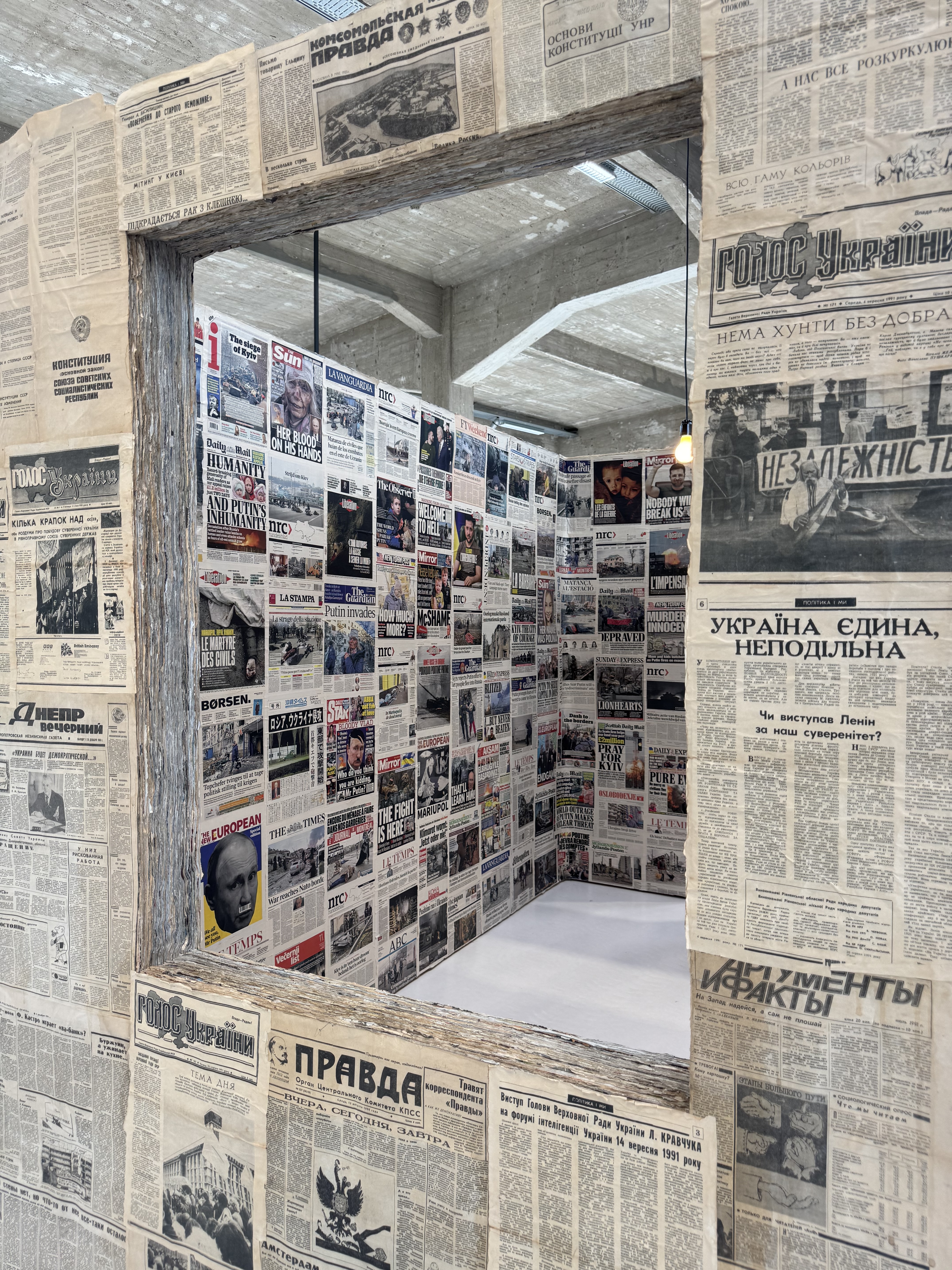
What actually holds is coherence — and here she draws a distinction I’m going to steal wholesale, because half my working life is spent in rooms where coherence and consistency are treated as synonyms. Consistency is surface: same logo, palette, tone, templates, everything governed until no rogue shade of blue can threaten the enterprise. It photographs as discipline and is often just rigidity with a hex code.

Coherence is the sense that the choices belong together, even when they don’t look the same. Consistency asks whether the parts match; coherence asks whether they came from the same place. You can be flawlessly consistent and mean absolutely nothing, which explains an alarming amount of corporate communication.

And then the question I’d put on a poster: would any of this still be standing if you stopped posting tomorrow?

I read all of this while planning a mailing list, a webinar and another run of book promotion, so I’m not claiming any position of moral superiority here. The most coherent thing I did all week was spend several hours in a hammock looking at objects that have existed for billions of years without once publishing a thought-leadership carousel.

Then I came home and wrote about them on the internet. The stars, presumably, remain relaxed about the competition.

Coverage

In.Comms asked five comms pros (including me) whether it’s internal comms’ job to motivate employees. Nobody said yes, which I found reassuring, because we’ve spent far too long accepting accountability for things we have almost no authority over.

Pay. Workload. Leadership. Whether the work itself is any good. Whether your manager is a prick. Motivation is downstream of all of these things, and when they’re not working, asking comms to boost engagement is applying corporate Febreze to a structural problem.

What we can do is help people understand what’s happening, why it matters and where their work fits. What we can’t do is communicate someone into being happy about a job that’s giving them perfectly good reasons not to be. My bit sits alongside Jennifer Sproul, Jo Coxhill, Adeela Warley and Rachel Miller.

Also recorded this week: Jon and I joined Nancy Goebel on DWG’s Digital Impact podcast to talk about designing channels employees actually use — the five layers, why most organisations have a coherence problem rather than a channel problem, and the intranet manager who hit an annual page-view target in 48 hours by leaving fifty browser tabs auto-refreshing.

This is both objectively funny and a near-perfect demonstration of what happens when a metric stops measuring the thing and becomes the thing. Somewhere, a dashboard was green. Everyone could go home.

Out in the autumn, at which point I’ll link it properly.

This week in photos

Weeknote 2026/32

The World Press Photo 2026 exhibition inside De Nieuwe Kerk. A red entrance panel sits beside a large black and white portrait of an older woman in traditional dress. Photographs are hung on curved slatted wooden screens down the stone nave, with red banners overhead.
World Press Photo in de Nieuwe Kerk (Photo: me)

I’ve started thinking about the things that earn their place.

Not in a minimalist, throw-away-everything-that-doesn’t-spark-joy sense. I own far too many shoes for that, and my travel plans would not survive even the most cursory audit. More in the sense that addition ought to come with a burden of proof.

We’re very good at adding things. Another name. Another message. Another platform. Another feature. Another trip. Complexity accumulates almost invisibly because every individual addition can be made to sound perfectly reasonable on its own. It’s only when you stand back that you realise you’ve built something requiring a diagram, a 45-minute induction and a SharePoint page explaining which SharePoint page to use.

This week threw a few variations of that at me, from some fairly unexpected directions.

More isn’t inherently the problem. Neither is less inherently virtuous. The interesting bit is what happens when you stop assuming that adding something automatically makes the thing better.

The question is whether it earns the space it takes up.

This week at work

Four client projects, two proposals, and all the usual scaffolding of running a business — invoices, contracts, the small administrative barnacles that attach themselves to any given week. Jon is still away. So: a lot.

Everything is moving in the right direction, at least. But four projects at four different stages means four sets of context, four vocabularies, four mental models to load and unload across a single day. The work isn’t the tiring bit. The switching is. By Thursday I had approximately six organisations’ worth of information in my head and no reliable way of knowing which one any given acronym belonged to.

The consolation of weeks like this is the pattern-spotting. Do this for long enough and you start seeing the same problem turn up in completely different organisations wearing a different coat and insisting you’ve never met before.

This week’s recurring guest was naming.

Whether to give your channels names — and, if so, what — is one of the great perennial arguments of our trade. Alongside where IC should report into and whether anyone has ever successfully governed a SharePoint site by sending the site owner an annual email, it will presumably outlive us all.

I have Views.

Names can be genuinely useful. A name gives people something to hold onto. It’s a handle in a sentence: put it on Yammer, it’s in the Hub, check Connect. It makes an abstract thing tangible and gives people a shared shorthand for talking about it. This is useful. Humans like naming things. We named the moon and that doesn’t even have single sign-on.

The trouble is that intranets and employee apps actively resist being named, because they aren’t one thing. What do you call the platform that’s the news, the payslips, the policy library, the person finder, the canteen menu and, for reasons nobody can now reconstruct, the only place you’re allowed to order a new security pass?

Nothing specific fits. So you end up at Workplace. Or Engage. Or Connect. Or Hub.

Names for tools that do everything, which is another way of saying names that describe absolutely nothing.

Worse, every single one is already a product on the market. Frequently it’s also the name of another tool already inside the same organisation, bought by a different department in a different year with a different budget and announced with exactly the same adjectives.

We have been brought in more than once to adjudicate which platform gets to be called Workplace.

This is a service we provide. I would love to tell you it’s the most intellectually demanding work we do. It’s certainly the one that requires my best diplomacy skills.

My rule is simple: a name is only worth having if it saves you an explanation. If it doesn’t, you’ve just doubled your workload, because now you have to explain the service and the name — in every induction, on every intranet page, every time somebody new asks which one you mean.

Some years ago I worked somewhere with a room-booking system called Trimble.

Not a codename, nor a project name that had escaped containment. Just Trimble, because that was the vendor, and the vendor’s name had welded itself to the product the way Hoover did to vacuum cleaners, except nobody had ever heard of Trimble and nobody was going around saying they were going to Trimble a meeting room.

At some point a rule established itself: any mention of Trimble on Slack was answered with the same photograph of David Trimble. This one:

A black and white photo of Northern Ireland politician David Trimble, in the 1970s.

Same photo. Every time. No comment.

Nobody agreed to this. There was no meeting. No governance model. No launch plan. It simply became true, the way the most successful bits of workplace culture generally emerge while somebody elsewhere is writing a 34-page launch strategy.

It fired constantly, because most mentions of Trimble were people asking what Trimble was.

And that was precisely the problem, right there: the name was prompting the question it should have answered.

The joke ended when someone* laughed out loud in an open-plan office and had to explain why a photograph of the former First Minister of Northern Ireland kept appearing in response to questions about meeting rooms.

* it might have been me.

Eventually the organisation gave up and renamed it The Room Booking System. Everyone knew what it was immediately, forever, at zero ongoing cost. The photos stopped.

The postscript is that the software has since been sold twice and now lives inside MRI Software, where it’s called Space Scheduling. The descriptive half of the name outlasted four owners. The corporate half fell off somewhere between acquisitions, unmourned.

Call things what they are.

There’s a section on this in the Launching Channels chapter of the book, which is considerably more even-handed than I have just been: when a distinct name genuinely earns its keep, why naming competitions are a trap, and explicit permission to just call the intranet the intranet.

You do not have to call it Spark. You do not have to call it Connect. You definitely do not have to invite 14,000 employees to submit suggestions and then spend three months explaining why the winner can’t be used because somebody forgot to check the trademark.

Sometimes good design is simply resisting the urge to make a perfectly comprehensible thing more interesting.

Also this week

Saturday afternoon at De Nieuwe Kerk for World Press Photo, which I go to most years and usually leave in silence, feeling slightly worse about humanity. This year felt different, and it took me a while to work out why.

Not less bleak. There were still plenty of bombed-out streets and destroyed homes, and this year’s Photo of the Year is a family being separated by immigration enforcement in an American courthouse. Nobody’s going to World Press Photo for a restorative afternoon.

What had changed was the scale. Previous years have felt dominated by destruction seen from a distance: ruined blocks, flattened cities, the landscape of catastrophe. This year leaned much harder into resilience and resistance, told through single lives followed over months and years. Girls’ education. A 46-year-old woman living with anorexia. The lives of girls born by IVF to a 60-year-old mother. Afro-Latin communities in Colombia holding onto traditions carried from lands their ancestors were taken from centuries ago.

None of it was nice. That isn’t the shift here.

But there’s a difference between an image that shows you the size of a disaster and one that puts a person inside it and makes you stay there with them. Destruction at scale numbs you slightly, if we’re honest. At some point the numbers get too large, the rubble starts looking like other rubble, and your brain puts up a screen marked TOO MUCH.

Then, halfway round, I found the panel explaining what I’d already noticed. They’ve threaded eight projects through the exhibition under the heading Visions of Hope. The stated reason is media fatigue: audiences tell them they want to stay engaged with the world, but through stories that illuminate rather than overwhelm.

Which is a curatorial decision, obviously. But it’s also a comms one, made by an organisation whose entire purpose is bearing witness to the worst things human beings do to one another.

They’ve concluded that relentlessness is counterproductive. That if you overwhelm people, eventually they stop looking. And a record of the world that nobody can bear to look at isn’t doing much bearing witness.

It’s not a million miles from the argument I spend my working life making, arriving from a considerably more consequential direction: more information does not necessarily produce more understanding. At some point volume stops informing people and starts providing them with reasons to disengage.

The photograph I keep thinking about, though, was something else entirely.

Paula Hornickel photographed Waltraud, a resident at a care home in Albershausen, sitting across the table from Emma — a toddler-sized social robot made by a Munich startup.

German care homes are dealing with two crises at once: not enough staff, and residents who are profoundly lonely. One in five over-80s in care describe themselves as severely lonely. Emma recognises faces and remembers previous conversations. Waltraud was sceptical, then came round.

“When she tells her jokes, that’s really good.”

And there, unexpectedly, in the middle of a photojournalism exhibition, was one of the more interesting future-of-work stories I’ve encountered in a while.

We spend enormous amounts of energy arguing about which bits of knowledge work AI will automate. The lawyers. The developers. The copywriters. The consultants, who remain remarkably confident that everybody else’s job consists of repeatable tasks while theirs involves ineffable reserves of judgement and human insight.

Meanwhile, automation is turning up in care homes. At the one kind of work we tend to assume is irreducibly human because the work is being there with another person.

And it’s arriving not because somebody has produced a spreadsheet showing a 14% productivity gain. It’s arriving because there aren’t enough humans there.

I don’t know how I feel about that. I can construct the argument in both directions and dislike parts of both of them.

Waltraud seems fine about it, which is probably the only opinion that counts.

Consuming

Peaches at the Melkweg. My first gig in months, which for me is close to a personal record and not one I’m remotely proud of.

Worth the wait, though. A proper show. Giant inflatable spread legs. Dancers dressed as vaginas. Costume changes, choreography, staging that commits absolutely and unapologetically to the bit. None of the standing-behind-a-laptop-looking-intense business that passes for a live electronic set surprisingly often these days.

At one point Peaches simply walked out over the crowd, held up entirely by the audience, and carried on performing.

You either have that kind of contract with a room or you don’t.

There’s something enormously satisfying about watching someone who’s been doing this for decades know exactly what the room is for, and use every inch of it. No attempt to make herself tasteful or contemporary or slightly less Peaches now she’s in her fifties. If anything, more Peaches.

Came out sweaty, delighted, and mildly annoyed with myself for leaving it so long.

Travel

None, and I’m delighted about it.

I’m midway through a long stretch at home, and it turns out that’s exactly where I want to be. No airports. No packing. No waking up and having to spend several seconds establishing which country I’m in. Just my own bed, my own kitchen, and an entirely unremarkable knowledge of where all my things are.

The Dutch weather asks a lot of you. Months of grey, damp, low-ceilinged winter, the sort that makes you question not just your decision to move here but the entire concept of northern Europe.

But summer in Amsterdam is the finest bargain in Europe. Long evenings, terraces spilling into streets, everyone outside because we’ve collectively understood that this is temporary and must therefore be treated as an emergency. I’ve spent most of this one amazed at my luck in getting to live in it.

I could get used to this.

I have, obviously, booked an enormous amount of travel for the autumn.

This week in photos

Weeknote 2026/31

A WorldPride parade boat with a "25 Years of Marriage Equality" banner, dancers performing on top, watched by crowds along the Prinsengracht and from boats on the canal.
The Canal Parade on Amsterdam’s Prinsengracht canal (Photo: me)

I spent much of this week being reminded that systems have lives of their own.

You can appoint community champions, but the actual community will organise itself around somebody else. You can design an intranet around the company you think you have. Employees will build another one around the work they’re actually trying to do. You can ask whether AI can replace a chief executive. Then you’ll quickly learn the hard part was never making the decision; it was getting several hundred people to behave as though it was their idea all along.

And if you happen to inflate a giant Donald Trump on Amsterdam’s canals, the city’s seventeenth-century bridges will provide a piece of physical comedy no creative director could have improved upon.

Systems, it turns out, are always co-authored by reality.

This week at work

Two client conversations this week. Different organisations, different problems. Exactly the same mistake.

One is designing a pilot community. As always, the interesting conversations aren’t about technology, they’re about people.

Specifically, which people.

Not the loudest voices. Not the volunteers. Not whoever has Community Champion in their email signature. (We’ve retired the word champion, which is probably healthier for everyone.) The people you want are the ones who are already connecting the organisation without being asked. The colleague everyone seems to know. The person whose Teams chats somehow span six departments. The ones who bridge gaps that don’t officially exist. You find them by watching what they already do, not by asking for volunteers.

The other client wanted to know why their intranet wasn’t working.

It turns out it’s organised around the people who publish to it, not the people who use it. Search for something and you don’t land on “I need to book parental leave” or “How do I order a laptop?” You land on “HR Services” or “Corporate Operations”, because the architecture reflects the org chart rather than the work. One team became so frustrated they quietly built their own version elsewhere. Nobody approved it. Nobody budgeted for it. They just needed something that solved the problem in front of them instead of the one the organisation thought they had. These are some of my favourite projects because, on paper, nothing is obviously wrong. The platform is fine. The content is mostly fine. Governance exists. Ownership exists. Every individual decision makes perfect sense.

It’s like one of those suburban Frankenhouses assembled over forty years from planning permission, optimism and B&Q vouchers. The conservatory solved one problem. The loft conversion solved another. The garage became a gym for six months before the running machine became an expensive laundry drying rack, and the room was turned into an office. Every owner improved the bit immediately in front of them until the whole thing acquired the navigational logic of an escape room whose clues were designed by six different consultancies.

None of those decisions was irrational. Every extension solved a genuine problem. It’s only when you try to get from the front door to the garden that you realise the shortest route involves passing through six unrelated architectural eras and apologising to whoever’s on a Zoom call in what used to be the garage.

Organisations build digital workplaces in much the same way.

Nobody sets out to build something incoherent. It just accretes that way, one perfectly reasonable local decision at a time. Every team improves its own room. Every department hangs another sign. Every budget cycle adds another extension. Nobody is designing the journey. They’re decorating individual rooms.

Fixing it requires someone who can look across the whole floorplan and say, “Yes, that’s better for Finance, but it’s worse for everyone else.”

Which means you need two things in the same place: someone who genuinely advocates for employees, and someone with enough authority to overrule everybody else.

Most organisations have one or the other. Very few have both.

So the house keeps growing. Another extension. Another corridor. Another perfectly sensible decision that makes the whole thing slightly harder to live in.

Two client rooms. One week. Same lesson.

Also this week

The popup gym closed this week. I found myself milking every possible moment, signing up to five classes on five successive days. And even going to a gym closing party. I’m now a person who goes to parties at the gym. Who even am I?

This weekend was Pride in Amsterdam. It’s one of my favourite weekends of the year, and this year’s had an extra layer: Amsterdam is hosting WorldPride, marking twenty-five years since the Netherlands became the first country to legalise same-sex marriage.

The city has been celebrating all week. Around the corner from me, at the Westermarkt, the festivities opened with the Drag Olympics, featuring events such as stiletto sprinting and the handbag toss. As with so many Dutch traditions, nobody seemed entirely sure whether this had always existed or had simply materialised because it was a good idea.

Yesterday was the Canal Parade. Eighty boats making their way down the Prinsengracht, representing every imaginable corner of the city’s LGBTQ+ communities, from the Ministry of Defence to Roze 50+ to Amsterdam’s museums turning up together in solidarity. Noticeably fewer corporate boats than in previous years, and all the better for it.

The best float, by some distance, was an enormous inflatable Donald Trump and Vladimir Putin locked in an embrace.

Amsterdam’s canal bridges are lower than many of the boats, so every single one has to deflate before passing underneath, then reinflate on the other side.

Which meant that, every few hundred metres, Trump and Putin would slowly crumple into one another, disappear beneath the bridge in a heap of orange and grey vinyl, then rise majestically back into existence for the next stretch of canal.

Nobody planned that joke, but the bridges just kept telling it.

Coverage

Allie Nawrat at Unleash asked me to weigh in on Skyfall AI’s plan to buy a small software company and install an AI as CEO.

I’ll never turn down an invitation to opine on this kind of thing, so I was delighted to pen an op ed in response. My take is that they’re testing entirely the wrong thing.

The experiment assumes the difficult part of being a chief executive is making decisions. It isn’t. Plenty of people can make decisions. The difficult bit is persuading several hundred other people — each with their own priorities, incentives and entirely reasonable objections — to act as though those decisions were sensible all along.

Revenue, churn and customer growth are the exhaust, not the interior. If your test company is small enough that everyone already knows everyone else, you’ve just removed the thing that makes leadership difficult in the first place.

Which is why I suspect they’re less likely to discover whether AI can replace a CEO than whether a small software company can survive six months with an unusually confusing org chart.

And, small housekeeping note: the book is now finally out in the US and Canada too. If you’ve spent the last few weeks apologetically explaining to North American colleagues that it existed but was being withheld from them for reasons nobody could satisfactorily explain, you can stop doing that.

Travel

None. I’m home, holding the fort while Jon’s in Canada. Quiet on this front for now. The calm, however, is temporary. The autumn diary is now filling up at a rate that suggests Future Sharon has made a series of commitments Present Sharon hasn’t properly thought through.

This week in photos

Weeknote 2026/30

Me speaking to guests at the Digital Communications at Work book launch (Photo: Paul Clarke)

Some weeks resist the usual format. This is one of them. I could tell you what I’ve been reading, what I’ve been watching, or how many emails I ignored. But none of that is important right now.

The story this week is that we had a launch party for the book, and I appear to have spent the days since discovering I have way more feelings than I’d budgeted for.

It was on the roof of Shoreditch House, which meant the whole thing happened against the skyline of the city I was born in, went to school in, and — bar a few brief spells elsewhere — lived in until I was thirty-nine. Most of the professional life this book is built on happened somewhere down there. Parliament. Banks. Charities. Agencies. Clients. Conference venues. Tube stations. Whichever Pret happened to be closest to whichever office I was working in that week.

London has never really felt like one place to me. It’s always been commutes and postcodes and jobs. But from up there, all at once, it suddenly became one continuous story. My story.

I should mention the dress.

I bought an incredible dress because it had a cape. An actual cape. Like I was either accepting an Oscar or about to arrest Lex Luthor.

I mentioned this to everyone. Not metaphorically. Literally everyone.

I’d be halfway through thanking someone for supporting my career over the last fifteen years before my brain interrupted with TELL THEM ABOUT THE CAPE.

“It’s got a cape.”

Reader, it did.

About 110 people RSVP’d. Fewer made it, as is always the way. I noticed for roughly twelve seconds.

Because then I looked around the room and realised what was actually there.

Twenty years of work.

Not “networking”, which is what LinkedIn insists on calling it. Just… people. Clients. Colleagues. Friends. The people who taught us the trade, challenged our thinking, hired us, argued with us, let us test half-formed ideas on organisations they were responsible for, and occasionally trusted us enough to implement them. Every one of them has ended up in this book somewhere, whether they know it or not.

Looking around the room, I realised there are only two occasions where everyone from across your life turns up at once: your funeral, and apparently your first book launch if you’ve spent twenty years in the same gloriously niche profession.

I can recommend the latter. Better catering. Less crying. And the guest of honour gets to wear a cape.

I gave a speech. On paper it was mostly self-deprecating jokes, because I don’t really know any other way of getting through emotional occasions. But somewhere around the thank-yous the armour stopped working.

Because underneath all the jokes about procrastination and mutually assured productivity was the thing I was actually trying to say.

I met Jon on Twitter around 2010. We started writing blog posts together. Then reports. Then client work. Somewhere along the way we accidentally built a company. Sixteen years later there’s a book with both our names on the spine.

A sequence of events that’s as brilliant as it is ridiculous.

I’d assumed I was fine. I’m good at being fine; it’s practically a professional competency by this point. But then I found myself standing in a room full of people who had each, in their own way, nudged that sequence along. The people who hired us before we really knew what we were doing. The people who challenged our thinking until it got better. The people who introduced us to other people. The people who kept believing we’d eventually finish the bloody thing.

The book felt like the excuse. Looking around the room, it was obvious what we were really celebrating was twenty years of friendships, collaborations and opportunities that somehow, improbably, added up to this.

The fineness rather comprehensively deserted me.

And then the microphone screamed with feedback, Jon looked at me, and we both completely lost it.

Which, in hindsight, was exactly the right ending to the emotional bit.

There’s a particular problem with being the centre of attention at your own party, which I last encountered at my wedding. It’s the exact opposite of ordinary party anxiety. You don’t spend the evening worrying you won’t know anyone. You spend it knowing everyone, and barely managing to speak to any of them.

Every time I got properly into a conversation, someone needed me to meet someone else, sign a book, pose for a photo, or stand somewhere with marginally better lighting. I’d spot someone across the room I’d been meaning to catch up with for an hour, start making my way over, and immediately get intercepted.

If we started a conversation and then I disappeared halfway through it, I’m sorry. I wasn’t ignoring you. I was being aggressively celebrated.

The overwhelm, naturally, waited until the following morning.

Overnight we’d been tagged in dozens of posts. People writing about the book, about the evening, about seeing old friends and making new ones. What struck me most wasn’t what people wrote about us. It was what they wrote about each other.

Lisa, who’s worked with Lithos often enough to know exactly which bits of our thinking need challenging, mapped a startling number of her own career connections back to a single retweet of mine from when Twitter was still good. One introduction became work with the British Red Cross. That became more work. That became an entire direction for her career.

I’d completely forgotten that retweet had happened.

Reading everyone’s posts, I realised how many of those moments there had been. Lisa could draw a straight line from one retweet of mine to a decade of work. I could draw equally improbable lines back to at least a dozen people in that room: someone who hired me, someone who vouched for me, someone who made an introduction, someone who took a punt on us when “us” was still mostly an idea.

None of those moments felt important when they happened. They took minutes, sometimes seconds. It’s only years later, when everyone starts comparing notes, that you realise careers aren’t built out of grand strategic plans. They’re built out of hundreds of tiny acts of generosity that the person doing them has usually forgotten by the following Tuesday.

There’s also a good story about how the book itself got written.

Donna at Kogan Page asked me if I’d write one in 2023. I demonstrated my enthusiasm by doing absolutely nothing about it for roughly a year. Eventually I said to Jon, “What if we wrote it together, so social awkwardness forces us to finish it?”

And that is, apparently, how you write a book.

We split chapters, swapped drafts, edited each other ruthlessly until neither of us could remember who’d written what, and hopefully ended up sounding like one person.

As chapter ten repeatedly points out, launching isn’t the end. It’s the point where people finally get to decide whether the thing deserved launching in the first place. So this is, technically, the beginning.

Thank you to Appspace for sponsoring the evening, so the emotional wreckage at least came with an open bar. To Paul Clarke, who photographed it, which means the bits I was too busy feeling things to remember are safely on record. To Donna and Anne-Marie at Kogan Page, whose faith in this book’s eventual existence significantly exceeded the available evidence. To the Lithos crew, who have spent years patiently correcting the pronunciation of a company name that two communications consultants somehow chose without ever saying it aloud first. To our clients, for occasionally letting us discover what doesn’t work on their time rather than ours.

And to David, who has lived with this book for considerably longer than any husband should reasonably be expected to.

Anyway.

tl;dr: we wrote a book. I wore a cape.

The launch in photos